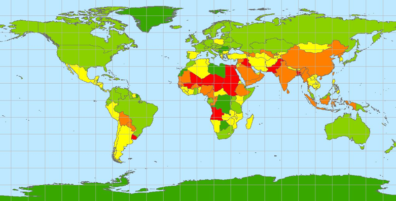
Graph 1: Air
pollution across countries. Air pollution across countries.
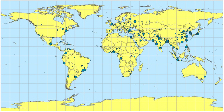
Graph 2: Positioning a country in GIS map.
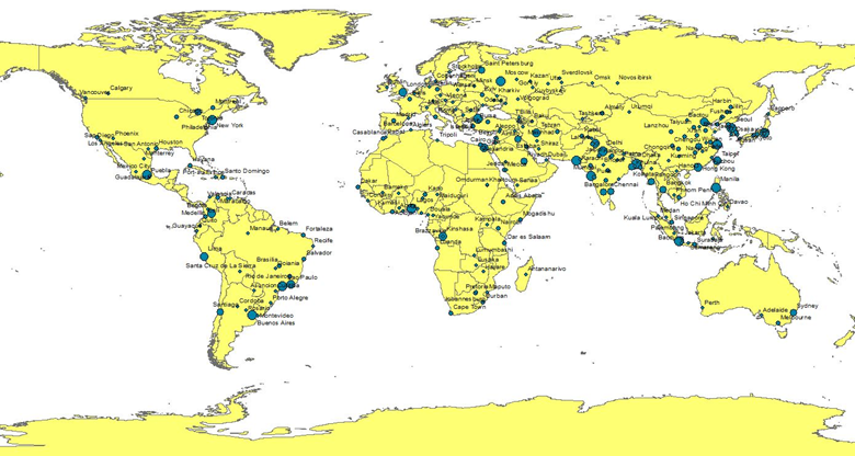
Graph 3: Cities around the
world.
Here,
I have placed three graphs generated in GIS. Data from 3a, 3b, and 3c are used
for these graphs. I do not have the text. I cannot try part 3d. I have ordered
for a digital version. For part 3c, I did not get any graph at the end of the
solution, but only a number about distance. So, two are taken from 3a, and one
from part 3b.
This
is the first time I am using GIS. I feel comfortable using it. GIS is cool.
Just clicking a different variable produces a totally different graph. It saves
time a lot.
But
there are some shortcomings for me. When tried to get the name of cities in map
2 with Create Viewer, sometimes, names are shown up and sometimes, not. For
part 3C, I dragged the map with Magnifier but could not be able to produce the
expected outcome.