Exercise
3 from ArcGIS 10
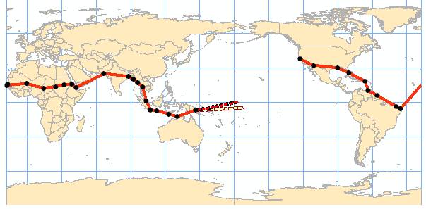
Figure 1 shows Amelia Earhart’s flight around the world using ArcMap software. Cities visited by Earhart are displayed on the map because it is layered on top of the countries in the table of contents. Additionally, the “Identify window” allows further access to data on cities marked on the map.
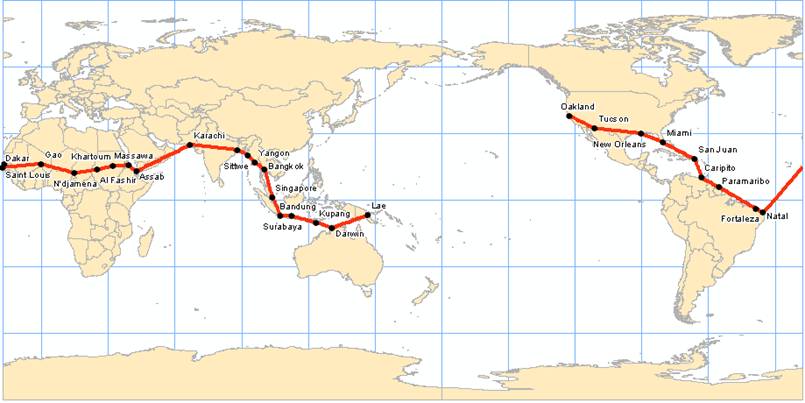
Figure 2 shows the ending points of Earhart’s flight. It is purposed her real path of flight was off course from the planned course, as shown by the dashed red line and solid red line, respectively. Through the “Magnification” option located in the “Window menu”, you are able to magnify the endpoints. A bookmark was created titled “End of Flight” that references the specified location and magnification and by using bookmarks already available we see islands associated with her proposed landing (Howland Island) and evidence of her crash (Nikumaroro Island). Finally, I measured the distance between the proposed and probable courses.
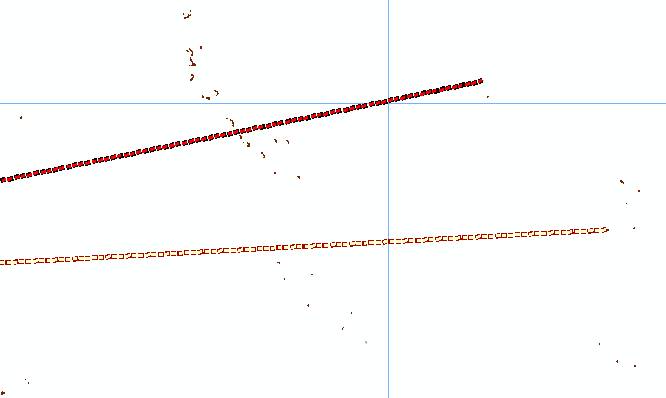
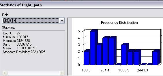
Figure 3 is a map of Earhart’s flight course and includes statistical data on the length of her flight path from city to city. This was done by accessing the “attribute table” and selecting attribute of interest, for example LENGTH. The attribute table for a particular layer provides data that is organized into specific attributes layers.