Assignment 1 : Create Webpage and submit Chapter 3 Exercises
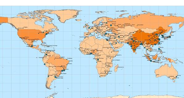
This first map was created by turning on labeling feature for the cities that are included in this map.
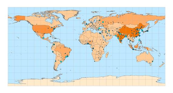
This second map was created by using the sort function under layer attributes table. I first sorted the cities by highest to lowest populations, then selected and displayed the top 12 cities with the highest populations. The circles with bright blue are the top 12 cities.
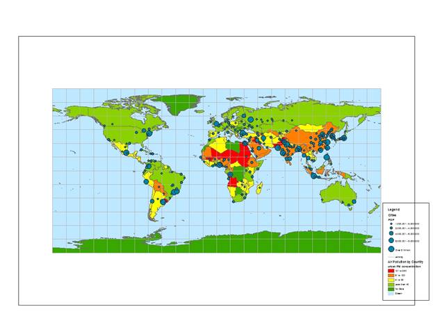
This map was created by displaying the populations of the cities around the world with informative symbology as the larger circles represent cities with higher populations and the smaller circles represent cities with lower populations. The colors that are represented by each country indicated the air pollution by each country, red being the highest amount of air pollution.