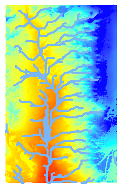
One of the first things I did when creating this map was to create a mosaic map to combine the 3 data files of 170, 180, and 190. Once they were combined I created a color ramp which represents elevation by color generally warmer (red) to colder (blue, higher elevation).
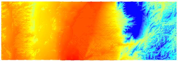
I then used a Fill command to fill in any low spots that are not accounted for in the DEM grid, ie. The center of the grid is the elevation that grid gets, therefore elevation detail is missed and can disrupt the stream flow on a map. I also kept the color ramp and did not invert it because I think the current color scheme make more sense with the higher elevation on the right from the Sandia Mountains signifying colder temperatures. With lower elevation on the left signifying warmer temperatures.
Next I put a command in for flow direction (FlowDirection(“FilledDEM).
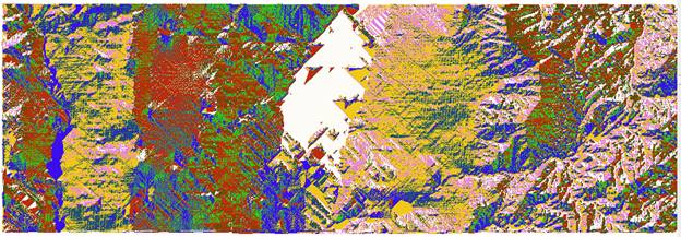
Then Flow Accumulation which calculates the number of grids accumulating onto eachother.
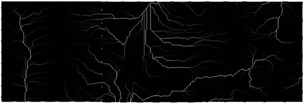
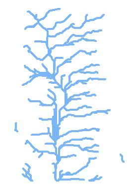
After I had the flow accumulation, I then created the stream raster by setting a threshold greater than 278, meaning if any grids had accumulations of over 278, then they were a stream. I then resized and changed this data in to a polyline called streams(lower left). I then used the “clip” feature to size my mosaic raster to the size of the stream polyline (below right). This function took a few tries to get all of the layers the size I wanted.
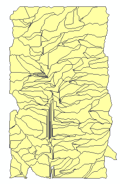
Next I created stream outlets wih a zonal statisics command for flow accumulation maximums. After that I created the watersheds and sub basin watersheds. This was done by naming Watershed raster as a combination of the flow direction raster and the outlets raster. See below.

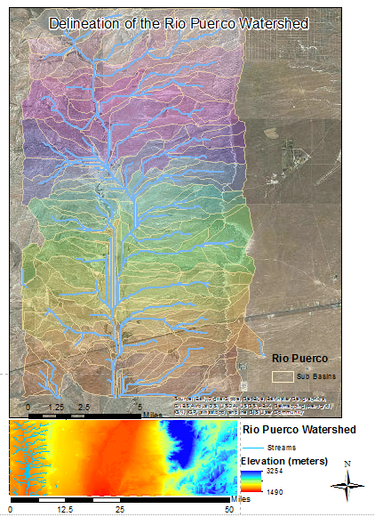
The finals steps were to use layout and develop a usable map. I placed the overall view on the bottom of the map with just the Rio Puerco streams displayed for reference. My final map is below I added the two scale bars, North Arrow and legends for both maps.