Assignment #1: Chapter 3 Exercises (Getting to Know ArcGIS®; 2013, 3rd Edition)
Assignment #1 tasks the student with creating a personal webpage
that includes at least three screenshots from the exercises in Chapter 3. These
screenshots must be accompanied by narratives that describe the process that
the student used to complete the exercises.
Exercise 3a, Displaying map data
In this exercise, one learns how to display data in ArcMap.
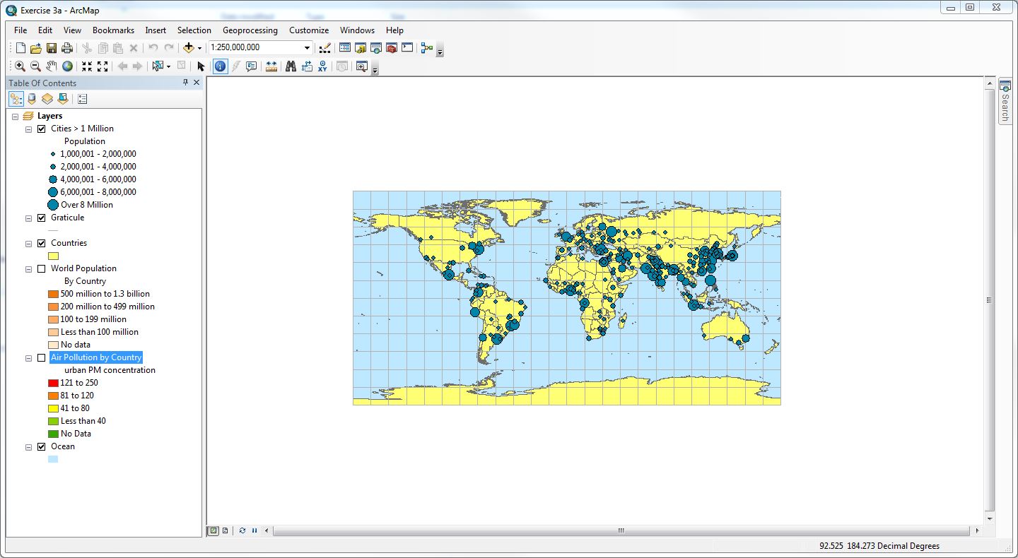
When opened, the map document is in Data View, and it displays a
world map with grid lines and dark-blue circles. These circles represent cities
with populations greater than 1 million people (with increasingly larger
circles representing larger populations). In the screenshot above, one can see
that only the “Cities > 1 Million,” “Graticule,”
“Countries,” and “Ocean” are the visible layers on the map. The order of these
layers in the Table of Contents place the layers on top of each other in the
map view. General properties of the layers can be changed by right-clicking on
the layer and then clicking on “Properties.” Information about the source
dataset for the layer can also be found under “Properties,” including its
feature class and the geodatabase that it is located in. In the map view,
individual countries can be selected using the “Identify” tool. When a country is
selected, the Identify window displays attributes about that country.
Exercise 3b, Navigating a map
In this exercise, one learns how to zoom and pan around a map, use MapTips, and identify features and examine their attributes.
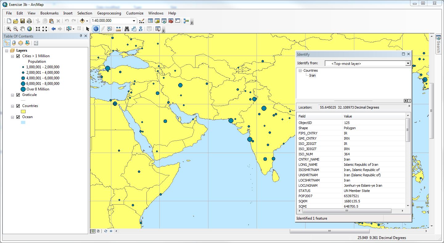
The map document opens similarly to Exercise 3a, and it is zoomed
out beyond the edges of the map. By utilizing the “Zoom In” tool, one can
manually select an area of the map to set the map view to. The “Full Extent”
button zooms back out to the original view; zooming in and out changes the
display scal, which is shown on the Standard toolbar.
As long as MapTips are turned on in the Display tab
on the Layer Properties dialog box, and regardless of which tool is active, the
country name should display as a MapTip when the
mouse pointer is over the country on the map. To move the map around to view
other countries, one can use the “Pan” tool (a hand symbol) by pressing and
holding the mouse button, and dragging the display. The screenshot above has
been panned to view the southern and eastern portions of the Asian and African
continents, respectively. By using the “Identify” tool, the map is showing
attributes about Iran. If the “Fixed Zoom In” and “Fixed Zoom Out” tools are
used, the display area will zoom in and out while maintaining the center point
of the current view.
Exercise 3c, Using basic tools
In this exercise, one learns about many common ArcMap tools and
functions that facilitate data exploration.
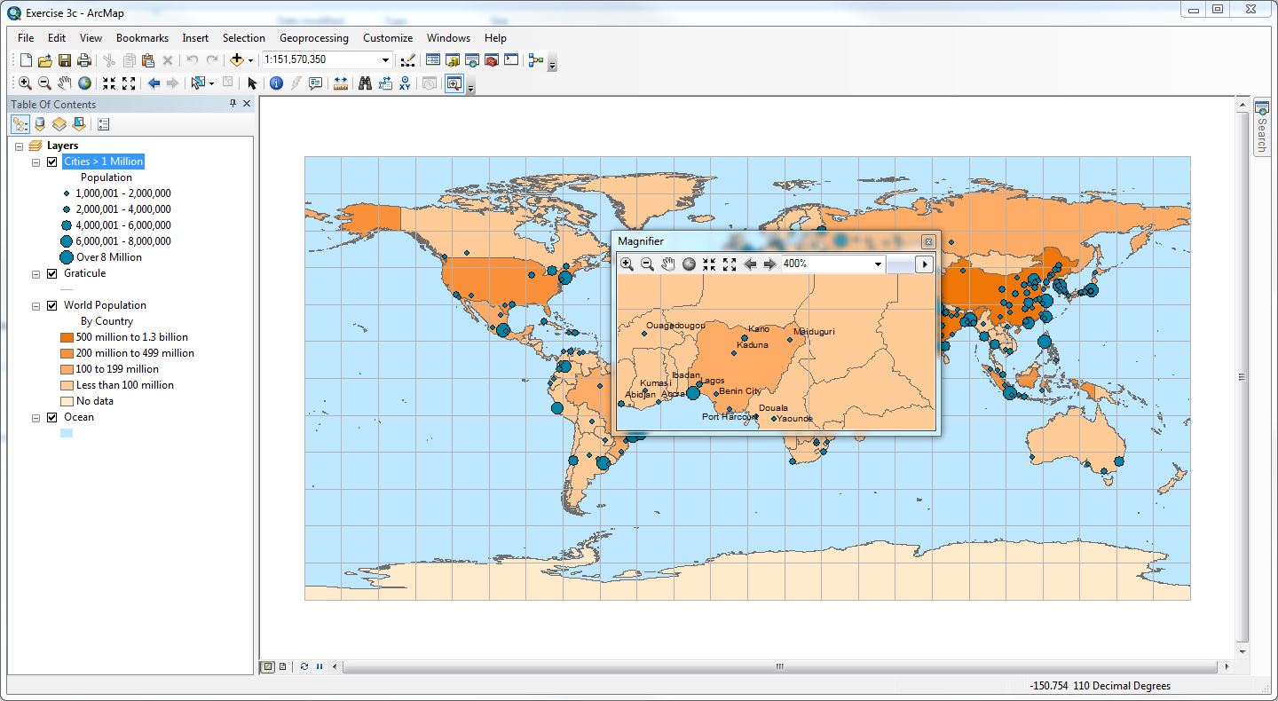
The map document in this exercise is similar to Exercise 3b, but
instead of the Countries layer it displays World Population. The legend under
the layer title in the Table of Contents indicates the shades of orange that
are used to show different ranges of total population. MapTips
are turned off, by default, in this map document. To turn them on, one must
open the Properties for the Cities > 1 Million layer, click the Display tab,
and select “Show MapTips using the display
expression.” Maptips for city names are now shown
when the mouse pointer pauses over the dark blue circles. Permanent city name
labels are also turned off, by default, in this map document. Obviously,
displaying city names at the Full Extent view will clutter the map. In order to
turn the labels on, but only make them appear at smaller scales, one must open the
Properties for the Cities > 1 Million layer, click the Layers tab, and
select “Label features in this layer” check box. In this exercise, the label
field is set to “CITY_NAME.” Next, one must click the “Scale Range” button, and
then select the “Don’t show labels when zoomed:” option. From here, one can
change the “Out beyond” (minimum scale) and “In beyond” (maximum scale) values.
In this exercise, the minimum scale is set to “1:80,000,000.” This setting will
allow the city labels to only appear when the scale bar on the map is set to
1:80,000,000 or less. One can look at a both a small scale and large scale view
of the map at the same time by using the “Create Viewer Window” tool. By
drawing a box around an area on the map, one can create a separate window in
which to see that area; in particular, if the scale is small enough, the Viewer
window may also show city labels. The Viewer window may also be set to be a
Magnifier, which acts like a magnifying glass on the larger map by dragging it
around. In the screenshot above, the Magnifier window is a 400% zoom in on the
area around Nigeria of the larger map. Finally, the “Measure” tool allows one
to determine the shortest distance, “as the crow flies” between two points.
Exercise 3d, Looking at feature attributes
In this exercise, the student learns how to examine the attribute
table for a layer.
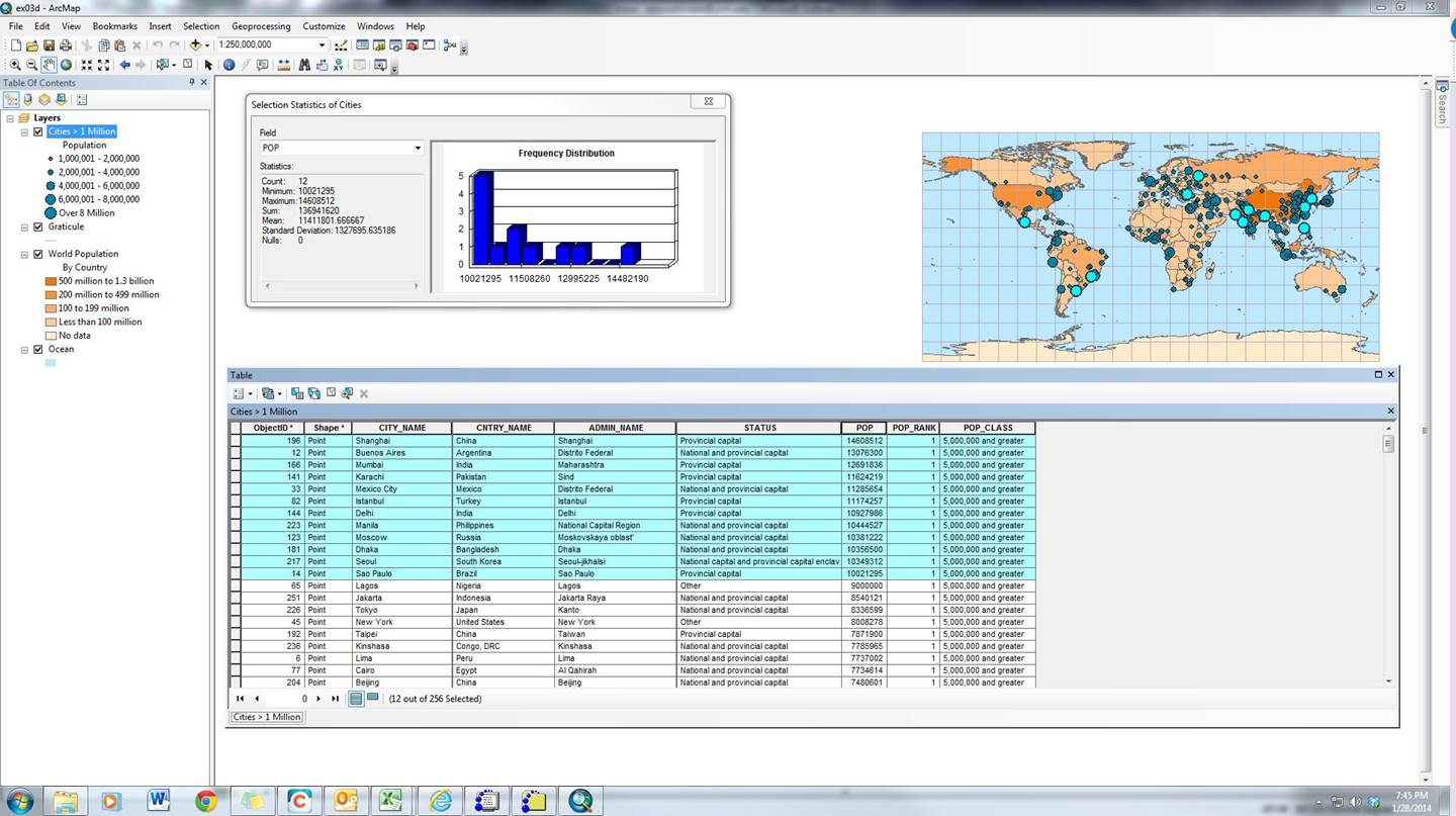
The attribute table for a layer can be pulled up by right clicking
on the layer title in the Table of Contents, and then clicking “Open Attribute
Table.” In the screenshot above, the attribute table for the Cities > 1
Million layer is open. The table shows all of the data for the cities in this
layer of the map. Each row of the table is called a “record,” and each column
is a “field.” The intersection of a record and field is called a “cell.” Fields
and records can be hidden, moved, and sorted, and statistics can be run on the
data in their cells. In the screenshot above, the records have been sorted in
descending order by the “POP” (population) field, and the top 12 records have
been selected. Statistics on the population of these 12 countries are
displayed, showing that the sum of people living the the
12 largest cities is 136,941,620, and 8 of these cities have populations under
11,508,260.
Assignment #2: Presenting Data
Assignment #2 tasks the student with using shapefiles
for the counties of New Mexico and for pan evaporation stations in the state in
order to create a new map, edit symbology, explore
statistics, and generate an appropriate map layout for displaying the data. The
student posts the layout on their personal webpage, including an explanation of
what they did and any major difficulties that they had in generating the
layout.
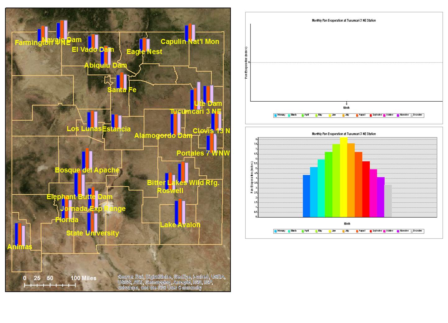
Prologue: A Hot Mess
This below output was a first attempt at using shapefiles
for the counties of New Mexico and for pan evaporation stations in New Mexico
to complete an exercise in displaying map and graph data for presentation
purposes. One intended to display data for three monitoring stations in order
to compare the shape of the graphs of their monthly pan evaporation.
Unfortunately, one was not able to remove the margins that appeared outside of
the first and last data points on the graphs. Further, one was not able to
arrange the symbols and labels on the map so that they did not overlap. After 2
hours, when these impasses could not be overcome, one began the assignment anew
and directly followed the assignment’s instructions, instead of customizing the
layout to a great extent.
Successful Attempt
The below output was at least a second attempt at using using shapefiles for the counties
of New Mexico and for pan evaporation stations in New Mexico to complete an
exercise in displaying map and graph data for presentation purposes. Instructions
provided for this assignment were very general, but are included here as
headings for the steps taken by the student to successfully complete the
assignment.
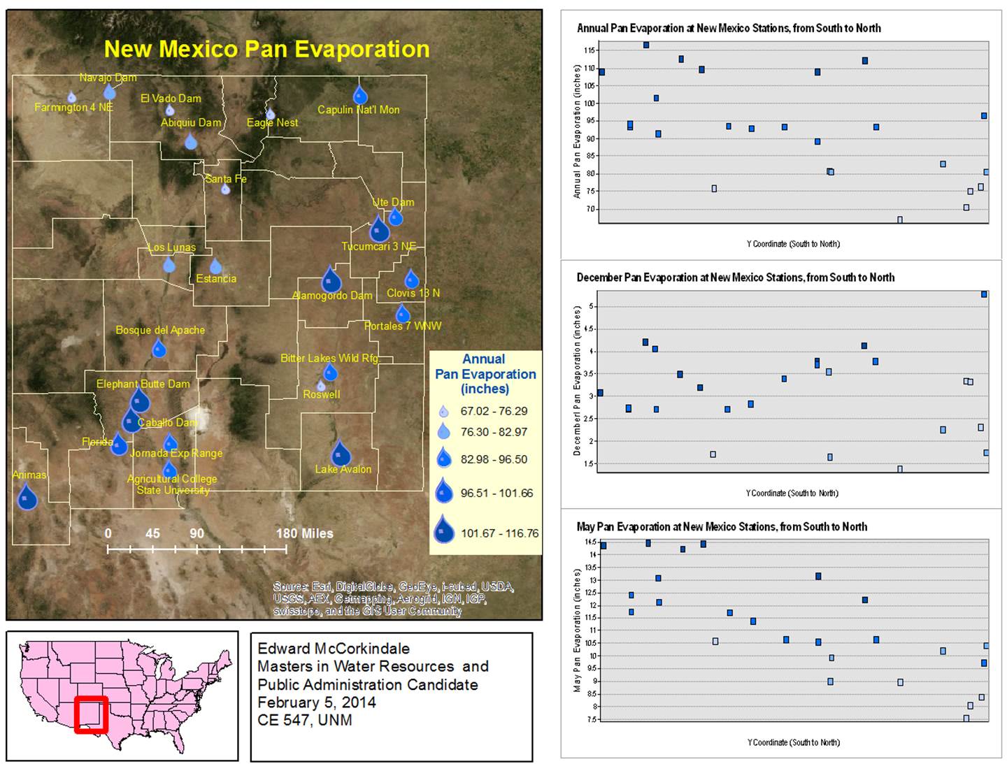
Creating a New Map, and Adding a Base Map
Data were provided by the assignment, although a basemap was not initially available. Upon opening a blank
template, one used “Add Data” to add a basemap from Esri Online. Of the basemap types
that were available, the “Imagery” basemap provided
desirable terrain features (e.g. vegetation and water bodies) without
unnecessary background labels (e.g. geological feature labels and street
labels).
Editing Metadata
Although the majority of metadata for the basemap
and layers are not visible in the image on the preceding page, the (barely
visible) text on the map of New Mexico is from the metadata for the basemap regarding the source for that Imagery.
Adding the New Mexico Counties and Pan Evaporation Shapefiles
Using the ArcCatalog application within
ArcMap, and ensuring the necessary folder connections to the location of data
for this assignment, one dragged and dropped the shapefiles
for New Mexico Counties (CountyData.shp) and pan
evaporation (PanEvap.shp). The desired map was displayed
by placing the basemap on the bottom and pan
evaporation on the top of the Table of Contents.
Editing symbology
Although ArcMap automatically designates symbology
for polygons (CountyData.shp) and points (PanEvap.shp), one changed symbology
settings to be more intuitive and effective for presentation. First, only
outlines were made visible for New Mexico Counties. Second, since pan
evaporation is associated with environmental parameters, a water drop symbol
was used for each monitoring station. Settings under the Symbology
tab in the layer properties allowed one to determine 5 classes of annual pan
evaporation values (67.02 to 76.29 inches; 76.30 to 82.97 inches; etc). The user changed the default sizes and colors for the
symbology so that the smallest class would still be
visible on the map, so that the increment size change was consistent across all
classes, and so that the shade of the symbol would be become darker with higher
classes.
Adding Labels
The only layer that requires labels is pan evaporation,
particularly for the name of the monitoring stations. Although Chapter 9 of
Getting to Know ArcGIS® for Desktop discusses the labeling of features and
provides several methods for effectively displaying labels, the practice of
labeling features on the map was very difficult in practice. Under the Labels
tab in the Properties for the pan evaporation layer, ArcMap provides several
ways in which to change the Placement Properties for labels. Some of the
symbols in this map are close together, and despite one’s best efforts to
define label placement and conflict detection settings so that label text did
not overlap with each other, there were still some issues with labels overlapping
symbols. By converting the labels to annotations, and going into Data View, one
was able to manually select individual labels and arrange them.
Changing the Map Layout
Using Insert in the ArcMap menu bar, one added a map title and
other text that describes the map. Insert also allowed one to insert a new data
frame, to which another shapefile was added for U.S.
States. This file came from Chapter 6 of the data provided with Getting to Know
ArcGIS® for Desktop. Under the properties for this data frame, the Extent
Indicators tab allowed one to add the original data frame to the list of extent
indicators that are visible. This action added a red box on the U.S. States map
that is dynamic based on the view of the New Mexico Counties map. Insert also
allowed one to add a scale to the map. Finally, a legend for the map was
Inserted via a complicated process of changing its margins (so that the legend
did not overlap with the county outlines) and removing the automatic text from
the feature name (unchecking “Show Heading” and “Show Layer Name” in Legend
Properties >> Style >> Properties >> General tab).
Adding and Editing Graphs
Under View in the ArcMap menu bar, one created three scatter plot
graphs to show the relationship, or the lack of relationships, between the
Y-Coordinates of monitoring stations (i.e. latitude) and pan evaporation. Using
the “Create Scatterplot Matrix Graph…” action first, one was able to view all
of the combinations of these variables, and chose three graphs that showed data
of interest. The X field (optional) was set to be Y_COORD, and the Y field was
set to be ANNUAL, DEC_IN_, and MAY_IN_. Once the graph is added to the display,
one can change the Advanced Properties for each graph using the Graph Manager
tool. Under Advanced Properties, one changed the increments for the y-axes, as
well as the titles for the graphs and their axes. These three graphs are
intended to indicate whether there may be a relationship between latitude and
pan evaporation values at monitoring stations in New Mexico.
Assignment #3 tasks the student with using projections and
coordinate systems for different data frames and map data. The student posts
the layout on their personal webpage, including an explanation of what they did
and any major difficulties that they had in generating the layout. Instructions
provided for this assignment were general, but are included here as headings
for the steps taken by the student to successfully complete the assignment.
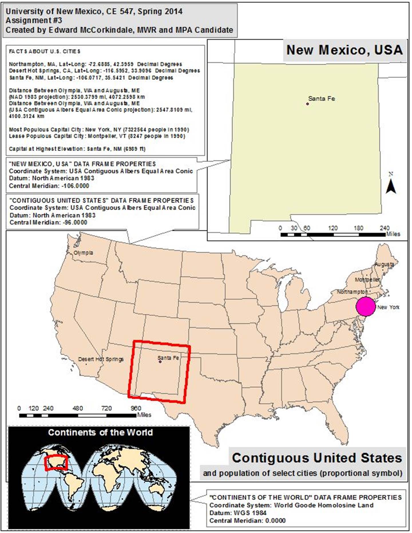
Mapping the World
Data were provided by the assignment, including various shapefiles for world, United States, background, geographic
feature, and latitude and longitude map layers. One first created a geodatabase
in which to save the files that one wants to use for this assignment. The
following feature classes were pulled from the provided data and included in
this geodatabase:
· USA
Feature Dataset:
o
cities
o
states
· World
Feature Dataset:
o
continent
o
WORLD30
Once this new geodatabase was created, a data frame for a world map
was created using “continent” and “WORLD30.” One placed the continent layer on
top of the WORLD30 layer in the Table of Contents, changed the WORLD30 color to
be blue (for oceans), and made the data frame background black (for contrast).
Finally, one changed the projection of the data frame to be World Goode Homolosine Land by activating the data frame and going to
“Data Frame Properties…” under View in the ArcMap Menu. On the Coordinate
System, one chose the desired projection and clicked “OK.”
Mapping the United States
A data frame for a United States map was created, and one added the
“cities” and “states” layers to the frame. The assignment asks several
questions about the data in these layers, and so one identified the cities that
needed to be known to answer these questions:
· Olympia,
WA (for measuring distance to August, ME)
· Augusta,
ME (for measuring distance to Olympia, WA)
· Desert
Hot Springs, CA (for latitude and longitude)
· Northampton,
MA (for latitude and longitude)
· Santa
Fe, NM (for latitude and longitude; this capital city is also at the highest
elevation, which is determined by opening the attribute table for the cities
layer, sorting the ELEVATION column descending, and looking for the first city
down the list that also has a “Y” in the CAPITAL column)
· Montpelier,
VT (the least populous capital city, which is determined from the cities layer
attribute table by sorting the POP1990 column ascending and looking for the
first city down the list that also has a “Y” in the CAPITAL column)
· New
York, NY (the most populous capital city, which is determined from the cities
layer attribute table by sorting the POP1990 column descending and looking for
the first city down the list that also has a “Y” in the CAPITAL column)
Under Properties for the cities layer, one built a query under the
Definition Query tab. In order to show only the cities lifted above, the
following query was used:
"CITY_NAME" = 'Olympia' OR ("CITY_NAME" =
'Augusta' AND "STATE_NAME" = 'Maine') OR "CITY_NAME" =
'Santa Fe' OR "CITY_NAME" = 'Desert Hot Springs' OR
"CITY_NAME" = 'Northampton' OR "CITY_NAME" = 'Montpelier'
OR "CITY_NAME" = 'New York'
The symbology for cities was changed,
under the layer Properties, to have proportional symbols based on the value of
POP1990 in the layer’s attribute table.
This data frame was originally in a geographic coordinate system.
One measured the distance between Olympia, WA and Augusta, ME using the Measure
tool before and after changing to a projected coordinate system (to USA
Contiguous Albers Equal Area Conic). One found that the distance was greater on
the projected map.
Mapping New Mexico
With the Select Features tool, one selected New Mexico in the
United States data frame. By right clicking on that layer, one chose
Data>>Export Data in order to export data for New Mexico into one’s
Assignment 3 geodatabase.
A third data frame was added to ArcMap, and the New Mexico data was
dropped into the frame. One also copied the cities layer from the United States
data frame.
With all data frames arranged in the layout view, one added
additional text and symbols to the maps. First, Extent Indicators were inserted
in the United States and World maps (Properties>>Extent Indicators).
Next, one inserted titles for each map (Insert>>Title). Then, one added a
North Arrow to the New Mexico map (Insert>>North Arrow) and scale bars
were added to the New Mexico and United States maps (Insert>>Scale Bar).
Finally, one added text boxes for each map that includes information about
their coordinate systems (Insert>>Dynamic Text>>Coordinate System).
Each box was changed into a “callout” by making changes to their properties
(Properties>>Text>>Change Symbol>>Edit Symbol>>Advanced
Text>>Text Background>>Balloon Callout).
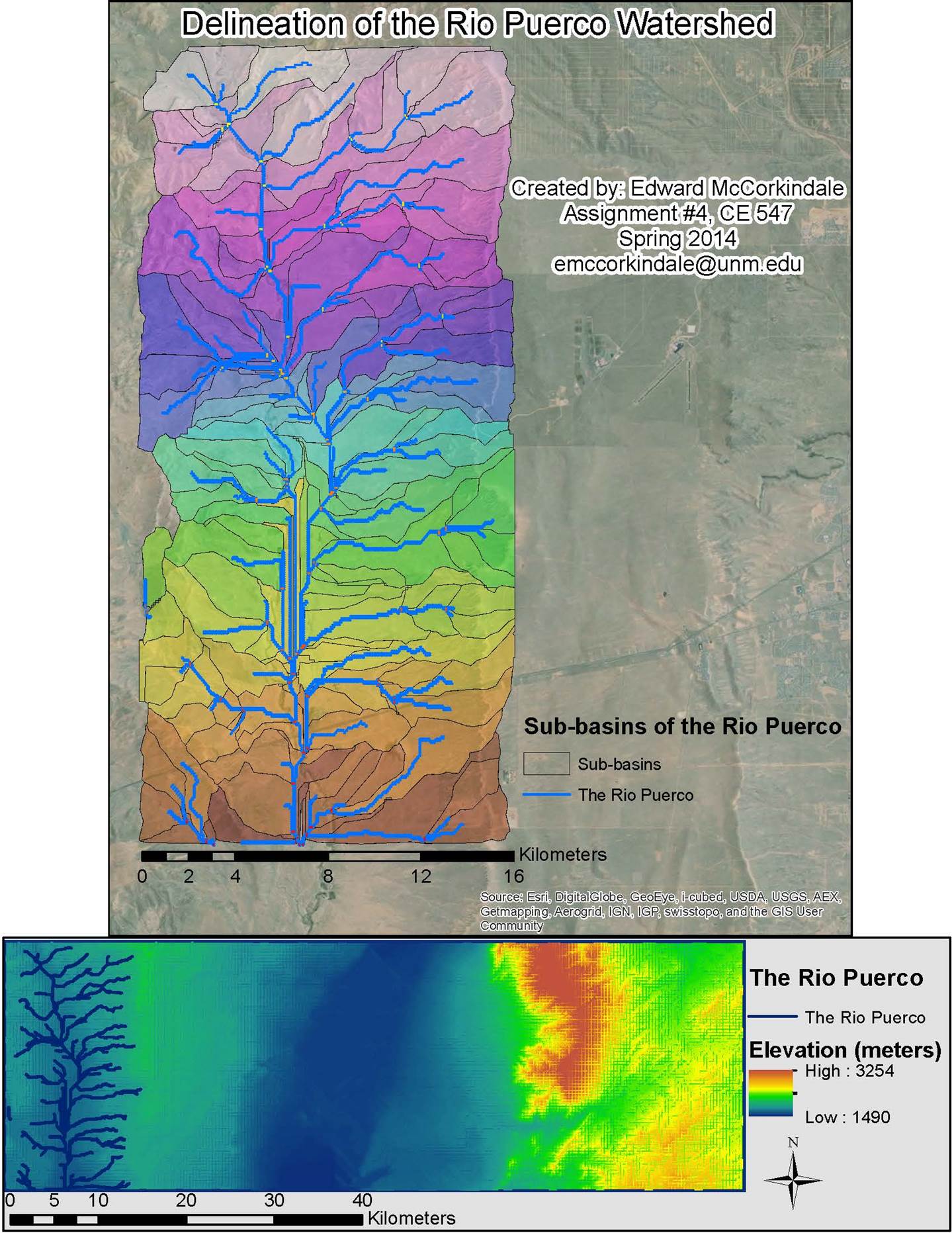
Assignment #4 tasks the student with completing several hydrologic
analyses, including basin delineation. This exercise involves multiple steps of
raster calculation, as described in the below matrix.
|
Source Layer/File |
Operation Performed on Source Layer |
Purpose of operation |
Additional Description |
|
|
raster177 |
E177.e00 |
ArcToolbox>>Conversion Tools>>To
Coverage>>Import from E00 |
|
|
|
raster178 |
E178.e00 |
ArcToolbox>>Conversion Tools>>To
Coverage>>Import from E00 |
|
|
|
raster179 |
E179.e00 |
ArcToolbox>>Conversion Tools>>To
Coverage>>Import from E00 |
|
|
|
MosaicRaster |
raster177, raster178, raster179 |
ArcToolbox>>Data Management
Tools>>Raster>>Raster Dataset>>Mosaic |
Makes three rasters
continuous |
This layer combined all of the
above rasters into raster177, thereby replacing it |
|
FilledMosaicRaster |
MosaicRaster |
ArcToolbox>>Spatial Analyst
Tools>>Hydrology>>Fill |
Fills spurious pits in raster |
|
|
FilledDEM |
FilledMosaicRaster |
ArcToolbox>>Spatial Analyst Tools>>Map Algebra
FocalStatistics("FilledMosaicRaster",
NbrRectangle(4,4,
"CELL"),"MEAN"),
"FilledMosaicRaster") |
Averages values of cells around No
Data cells and fills the holes |
This layer is now ready for
hydrologic modeling |
|
FlowDirection |
FilledDEM |
ArcToolbox>>Spatial Analyst Tools>>Map Algebra |
Produces an eight-direction flow
model, where there are eight valid output directions toward which flow can
travel |
|
|
FlowAccumulation |
FlowDirection |
ArcToolbox>>Spatial Analyst Tools>>Map Algebra |
Produces a model of the accumulated
flow to each cell that is determined by accumulating the weight of all cells
that are upslope of each cell |
|
|
Streams_RioPuerco |
FlowAccumulation |
ArcToolbox>>Spatial Analyst Tools>>Map Algebra Same as Display |
Cells with more than 278 cells
flowing to them will be defined as streams; the extent becomes limited to the
Rio Puerco |
The map was zoomed in on the FlowAccumulation layer such that only the Rio Puerco
River was visible. Processing of just this extent will only show the streams
for this extent, and this extent will be used for all operations going
forward. |
|
Stream_Network_RioPuerco |
Streams_RioPuerco, FlowDirection |
ArcToolbox>>Spatial Analyst Tools>>Map Algebra
"FlowDirection") |
|
|
|
ZonalMax_RioPuerco |
Stream_Network_RioPuerco, FlowAccumulation |
ArcToolbox>>Spatial Analyst Tools>>Map Algebra
ZonalStatistics("Stream_Network_RioPuerco",
"Value","FlowAccumulation",
"Maximum") |
Produces a model of zones based on
these two rasters |
This is the first step in defining
stream outlets |
|
Outlets_RioPuerco |
FlowAccumulation, Stream_Network_RioPuerco |
ArcToolbox>>Spatial Analyst Tools>>Map Algebra |
Produces a model of zonal max flow
accumulations |
Zonal maxes are considered flow
outlets |
|
Watersheds_RioPuerco |
FlowDirection, Outlets_RioPuerco |
ArcToolbox>>Spatial Analyst Tools>>Map Algebra
"Outlets_RioPuerco") |
Produces a model of delineated
sub-basins |
In order to hide No Data cells, one
must enable Display Background Value (in the Symbology
tab of the Layer Properties) and set the fill color to "No Color. This
layer is also made semi-transparent in order for the basemap
to be visible behind it. |
|
Sub-basins |
|
|
Produces polygons of each
delineated sub-basin in the Rio Puerco watershed, which will serve as
sub-basin outlines on the map |
Once the fill for this layer is set
to "No Color," the outlines of the sub-basins are visible. In order
to hide the outlines of No Data value areas, one must add the Editor toolbar
to ArcMap (Customize>>Toolbars>>Editor), and select "Start
Editing" from the Editor dropdown. By opening the Attribute Table for
the Sub-basins layer, one may sort the grid_code
column, select the rows with a "0" value, and deleting those rows. |
|
The Rio Puerco |
Stream_Network_RioPuerco |
ArcToolbox>>Spatial Analyst Tools>>Hydrology>>Stream
to Feature |
Converts the raster stream into a
polyline feature |
|
|
Basemap |
|
|
|
No operation is performed on this
layer. One adds a basemap layer by selecting
"Add Basemap.."
in the ArcMap menu bar. In this map, an Imagery basemap
was used. |
In the end, only the FilledDEM (lower dataframe), The Rio Puerco (both dataframes),
Outlets_RioPuerco (upper dataframe),
Watersheds_RioPuerco (upper dataframe),
and Sub-basins (upper dataframe) were used as layers
and features in the final presentation of Assignment #4 above.
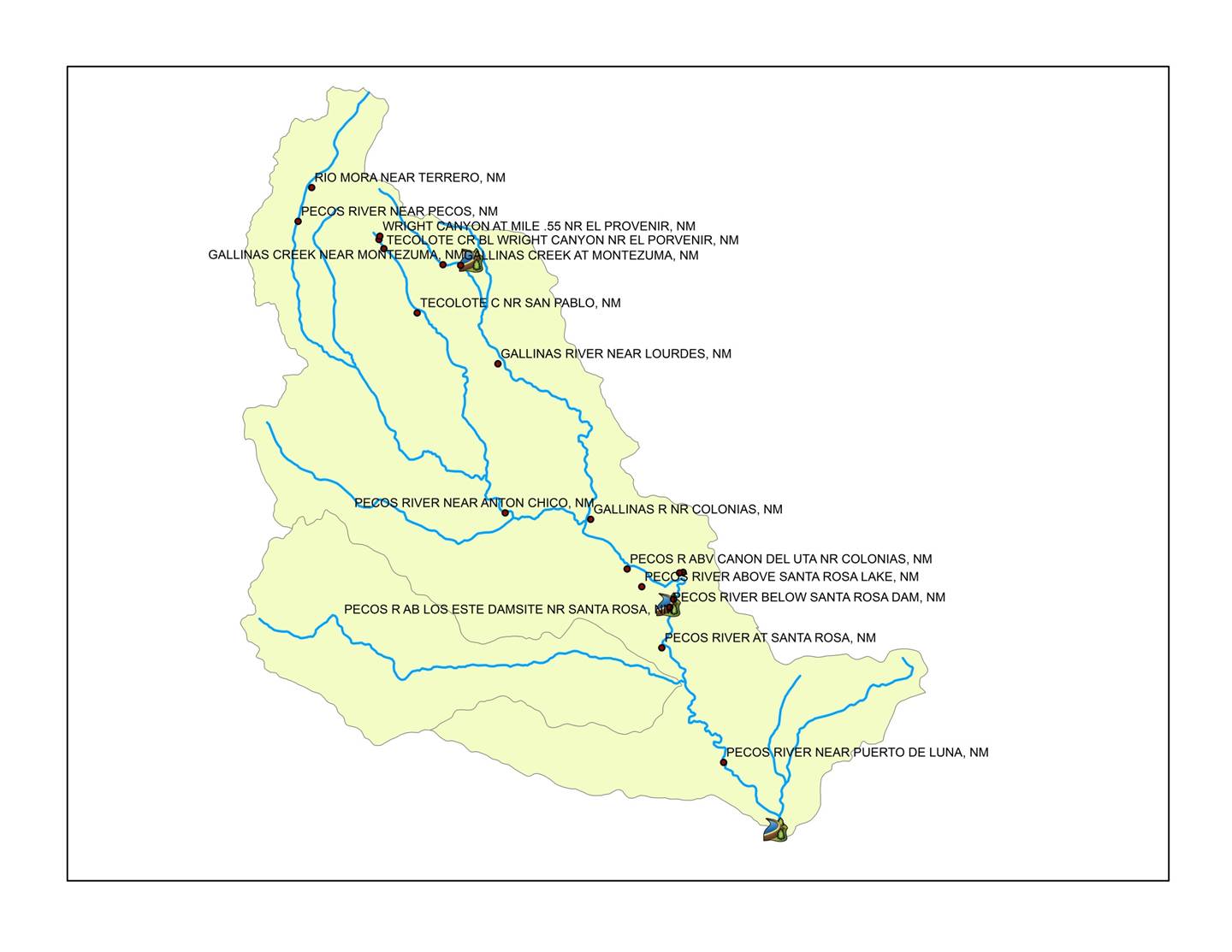
Assignment #5 exposes the student to national basin datasets and
importing external spatial and temporary data.
Part 1, Working with large
datasets
The geodatabase provided with this assignment includes the
following shapeefiles:
· huc250k
· Reservoirs
· Streams
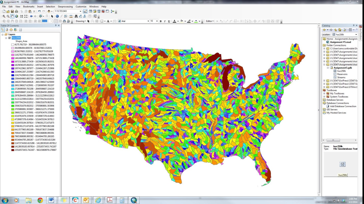
The above image shows the map after the huc250k layer has been
added.
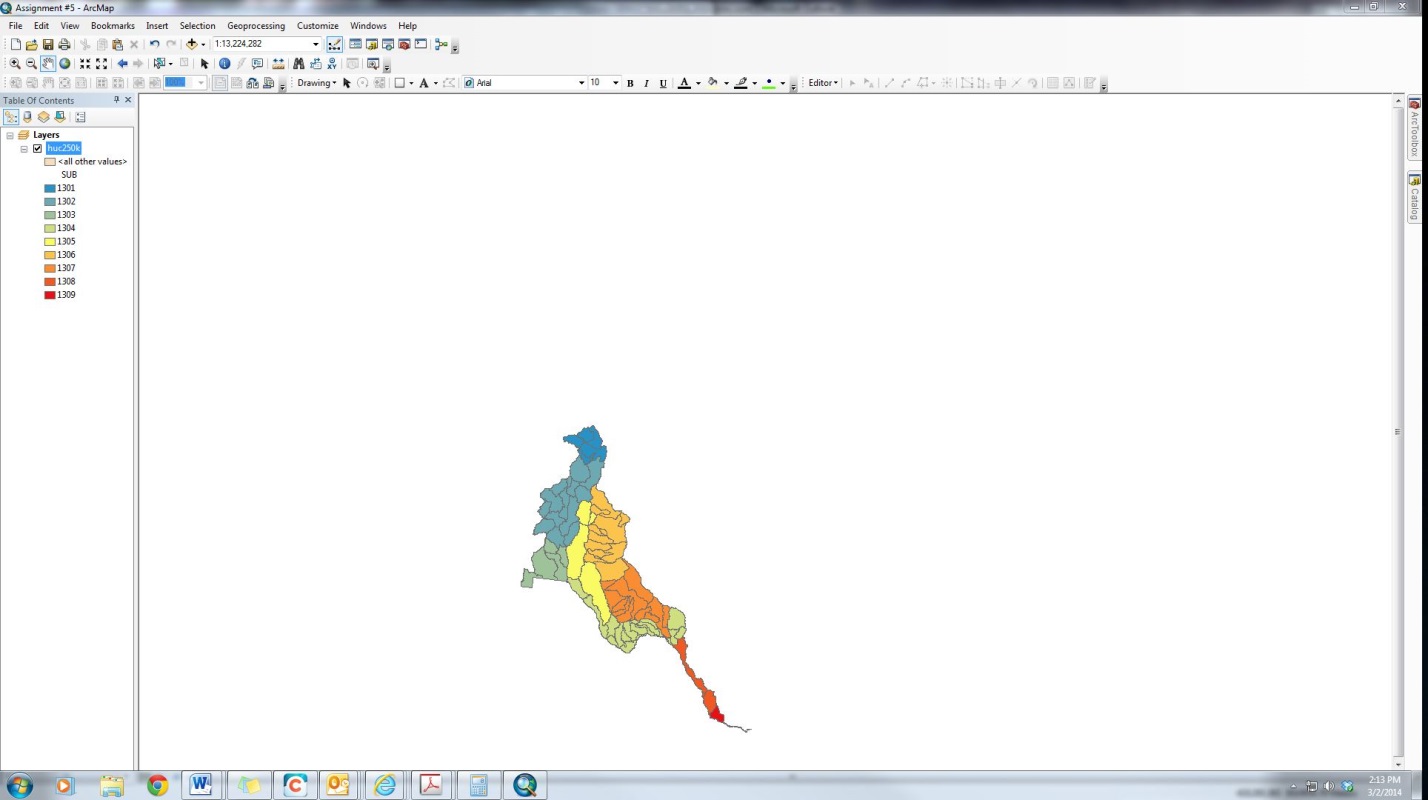
The huc250k layer can be isolated to the Rio Grande Watershed by
defining a query to (Properties>>Definition Query>>Query
Builder>>“REG” = ‘13’). The result is shown above.
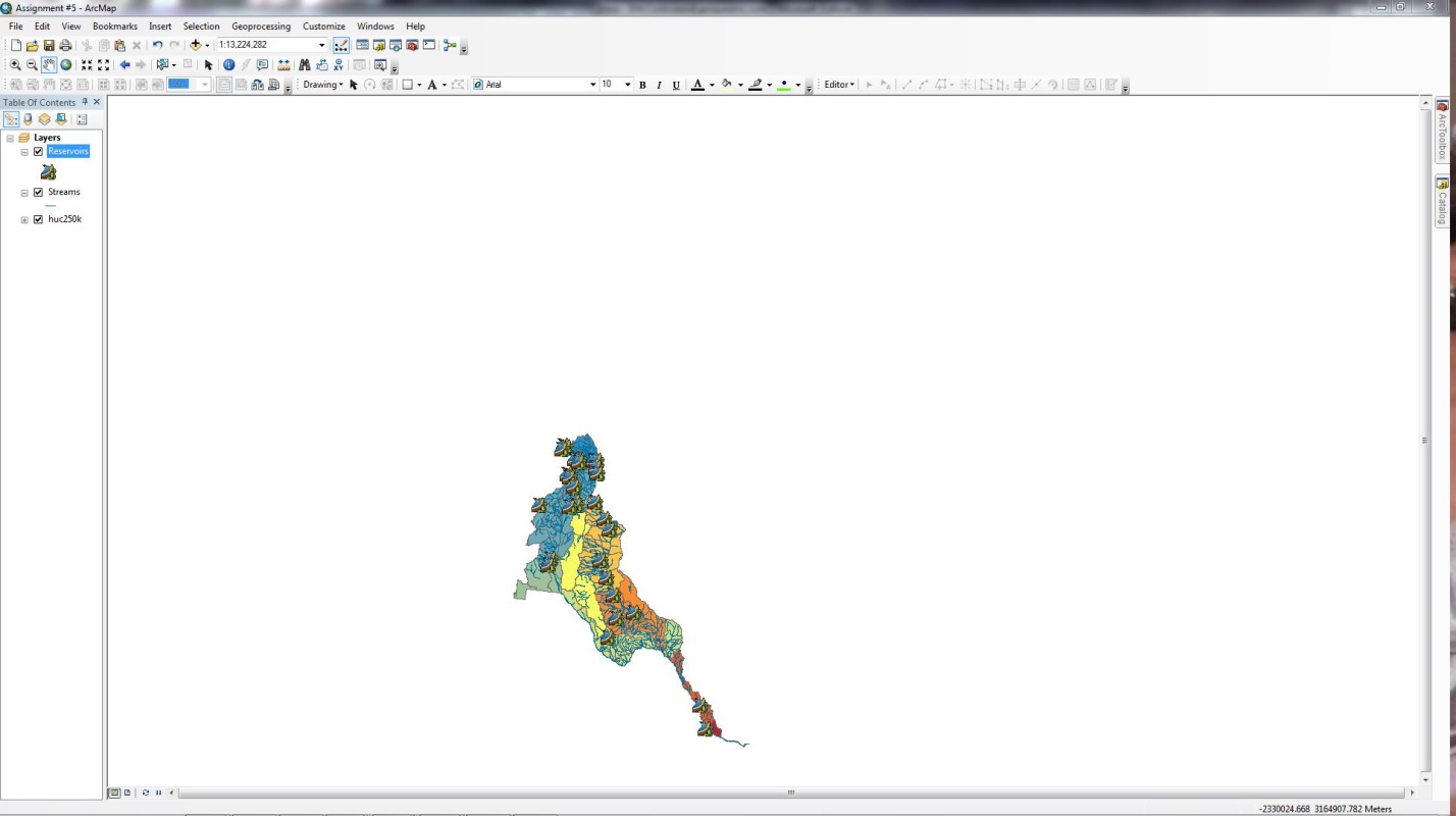
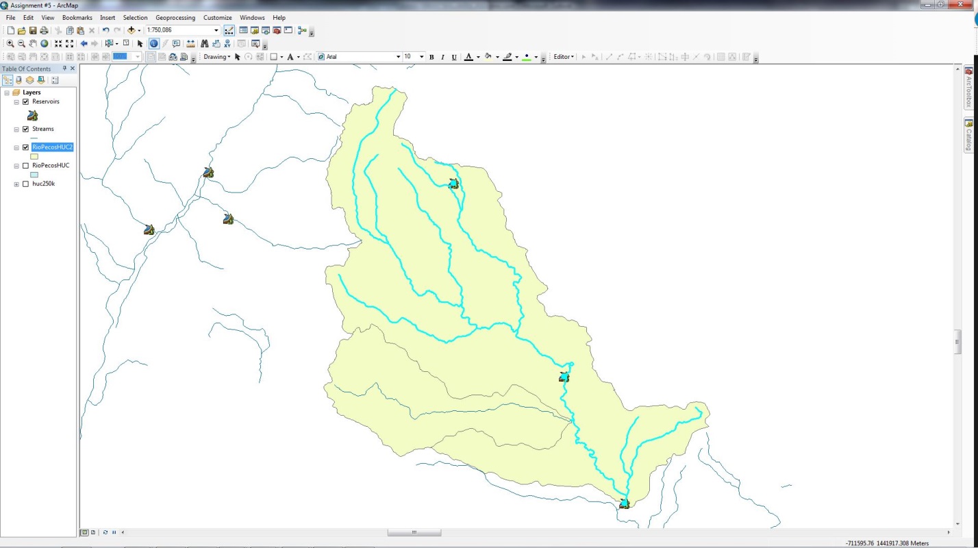
Once the Streams and Reservoirs layers are added to the map, and
the symbology is tweaked, the map looks like the
below image.
This exercise is focused on the Rio Pecos subwatershed,
which can be isolated by selecting the necessary subwatersheds
(Selection>>Selection by Attributes>>”CAT” = ‘13060001’ OR “CAT” =
‘13060002’) and exporting them to a separate shapefile
(RightClick layer>>Data>>Export Data), as
seen below.
The next step is to select rivers and reservoirs that are isolated
in these subwatersheds (Select by Location>>are
within a distance of the source layer feature>>-225 Meters) and exporting
the selected stream and reservoirs (separately) as new shapefiles
(RightClick layer>>Data>>Export Data), as
shown below. This method of selecting the streams and reservoirs works because
the distance is negative (within the shape boundaries), the distance is small
enough to include the reservoirs, and the distance is large enough to exclude
segments of outside streams while still capturing the upstream segment of the
Pecos River. Only selecting features within these watersheds in the Selection
pane does not include this upper segment.
Part 2, Adding stream gage
data
The USGS website provides the streamflow
data necessary for this exercise.
Historical Data>>Streamflow>>Annual
Site Location: Hydrologic
Unit (by Code)>>Submit
Hydrologic Unit (by Code):
13060001, 13060002; Site type: Stream; Available parameters: Streamflow; Site-description information displayed in:
tab-separated format
Fields: Site
identification number, Site name, Site type, Decimal latitude, Decimal longitude,
Decimal Latitude-longitude datum, Altitude of Gage/land surface, Altitude
datum>>Submit
When prepared in Excel (Excel 1997-2003 Workbook), these data is
designated as PecosHWSites.
Using the same settings, one may also review a list of sites with
links available for Annual Statistics (by selecting that option and
Submitting). After selecting all of the radio buttons for Discharge for all of
the sites, and producing a tab-separated file that is prepared as an Excel file
and designated as PecosHWData.
The first of these files to be imported is the PecosHWSites,
by going to File>>Add Data>>Add XY Data… in ArcMap. The following
settings are used:
X Field: dec_long_va
Y Field: dec_lat_va
Z Field: alt_va
At this step, it is important to change the projection of the data
to match the data that was downloaded from USGS (Coordinate System of Input
Coordinates>>Edit…>>Geographic Projections>>North
America>>NAD 1983). Without this change, the coordinates of the data will
be the same as the data frame (NAD_1927_Albers), and would likely be projected
far away from where they are supposed to be, particularly since the scale of
the map is small (distortions are more pronounced at smaller scales since the
map is zoomed in).
Part 3, Adding temporal data
to your map
The temporal data (PecosHWData) must also
be imported.
Rightclick
on geodatabase>>Import>>Table (Single)…
Input Rows:
PecosHWData.xls; Output Table: PecosHWData
On the newly added layer, one must join with the spatial data.
Rightclick
on the layer>>Joins and Relates>>Join…
Both fields: site_no; Joine to: PecosGageSites
Now, one must display the temporal locations as well.
Rightclick
on the layer>>Display XY Data…
X Field: dec_long_va; Y Field: dec_lat_va;
Z Field: alt_va; Coordinate System of Input
Coordinates>>Edit…>>Geographic Projections>>North
America>>NAD 1983
Now, the map is pretty much complete. By enabling Time in the new PecosHWDischarge layer, and using graduated symbology for discharge, one can work with animations that
show mean annual discharges over the extent of the data from USGS (1907 –
2013).
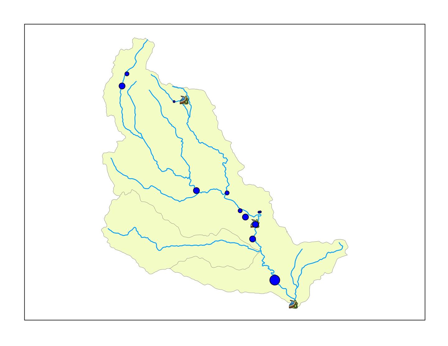
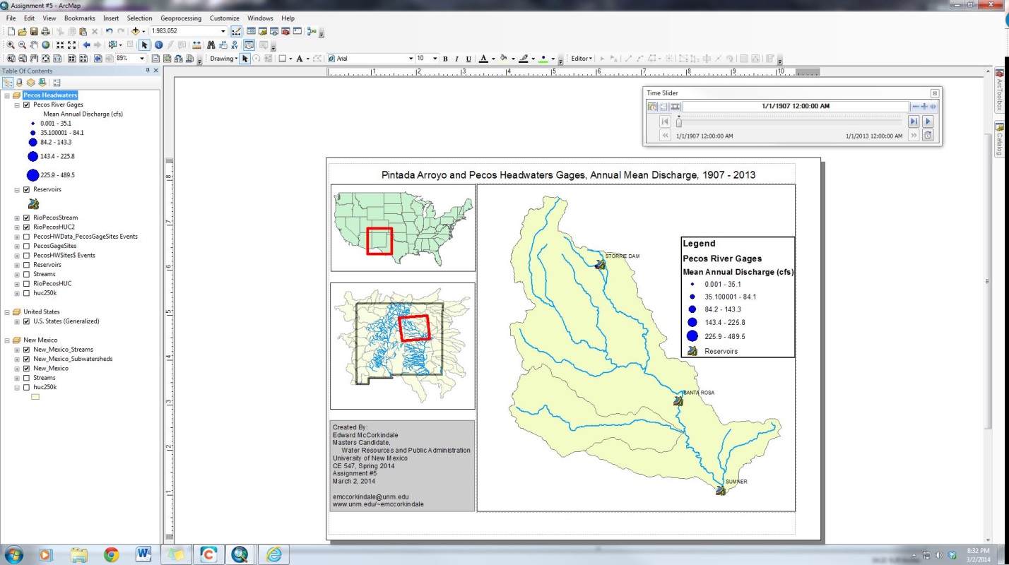
A video of the final animation for this assignment can be found
here:
www.unm.edu/~emccorkindale/Assignment5.avi
Assignment #6 tasks the student with using soils data from the
STATSGO soils coverage, as well as land use data. The student also learns about
joining and relating tables, and limited geoprocessing
commands. Like Assignment #5, Assignment #6 uses the headwaters of the Pecos
basin.
Part 1, Adding Data and Joining Tables
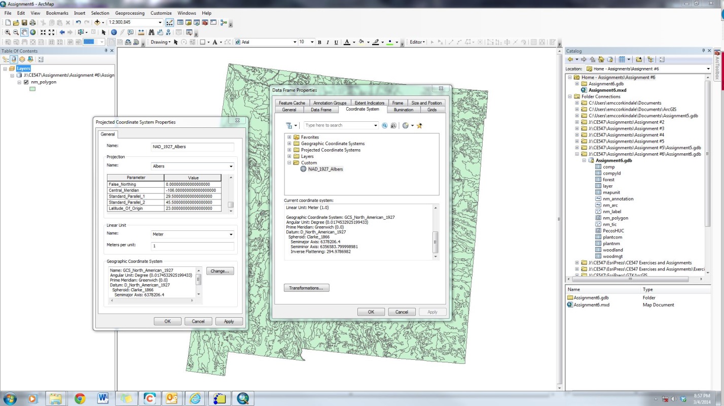
After the nm_polygon layer was added to
ArcMap, one changed the meridian for the map such that New Mexico is centered
in the data frame (View>>Data Frame Properties>>Coordinate
System>>rightclick active coordinate
system>>Copy and Modify…>>Change Central_Meridian
to -106).
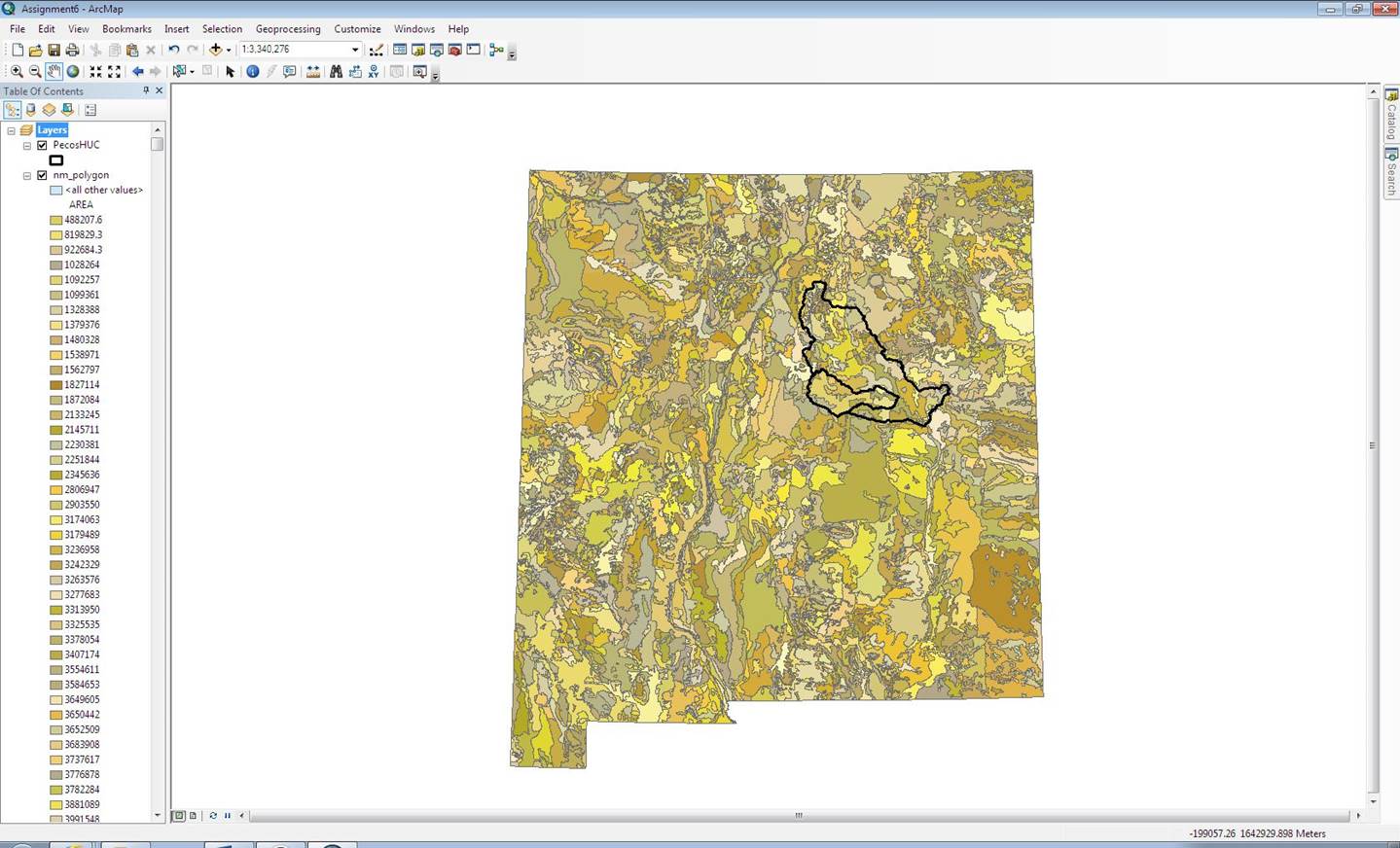
This reduced the number of records in the STATSGO units from 2084
to 86, and allowed one to focus on the Pecos headwaters soils.
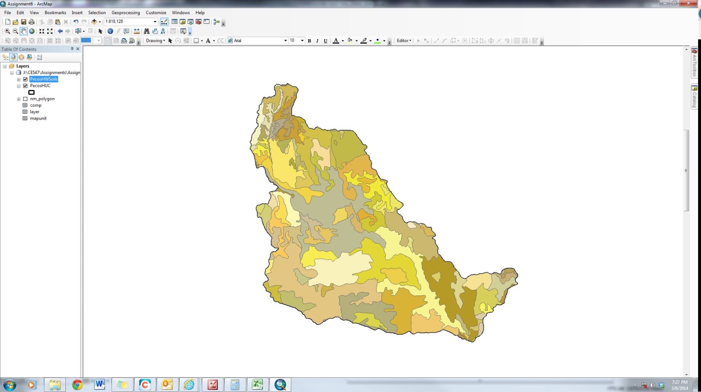
Next, one added STATSGO tables to ArcMap: comp, layer, and mapunit. In order to provide names corresponding to each mapunit of soils, one joined the mapunit
table to the PecosHWSoil soil layer (rightclicklayer>>Joins and Relates>>Join…).
This action adds additional fields to the attribute table for PecosHWSoils, based on the many-to-one join. From here,
soil properties can be calculated.
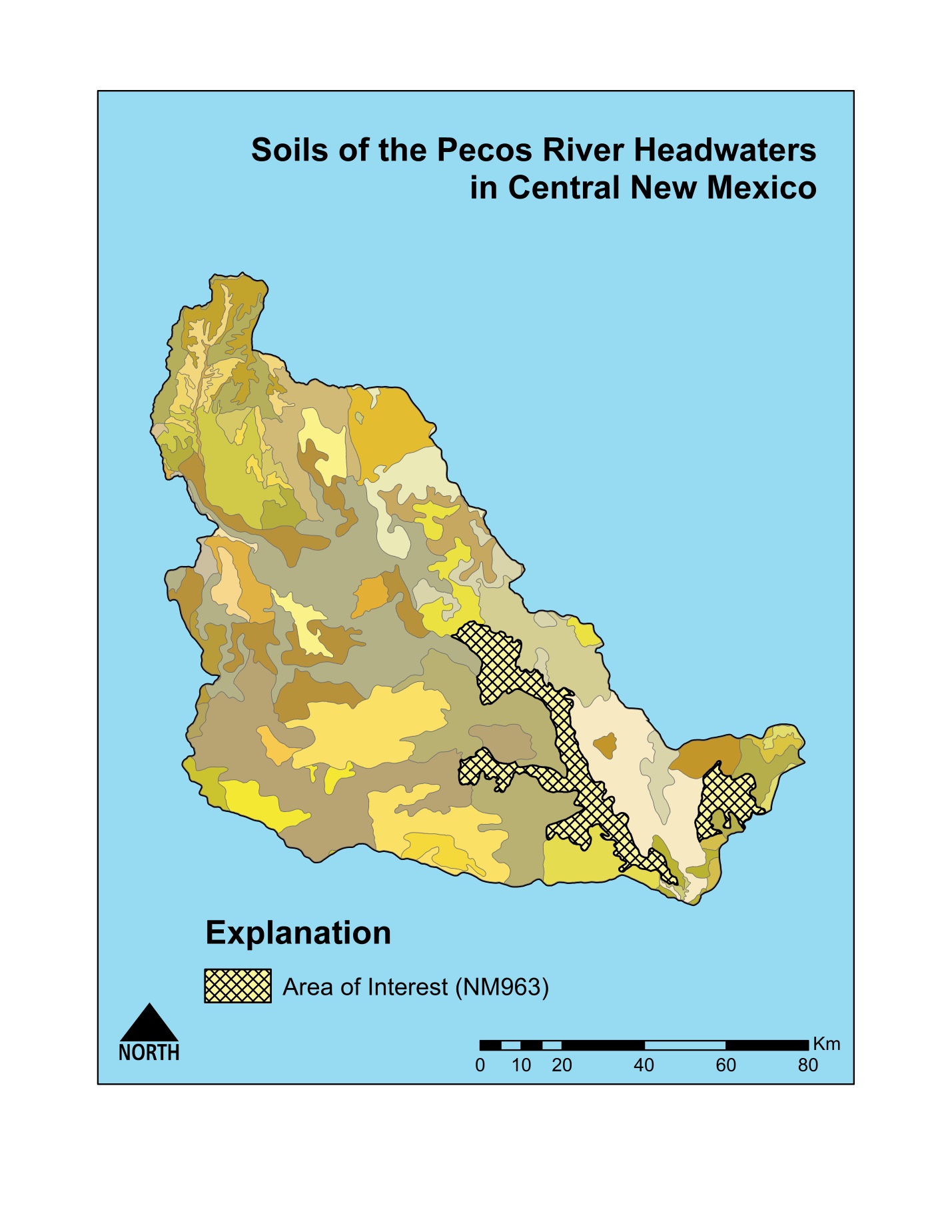
Part 2, Calculating Soil Properties
NM963 soils are composed of OBJECTIDs 2445 through 2452 in the
comps table, with surface slopes from 0 to 99 (if 99 is assumed to be “No
Data,” then the greatest slope is 80). The mean low slope is 8.625, and the
mean high slope (assume 99 is “No Data”) is 32.14, and at least 65% of the
surface in this area has a slope greater than 0. The dominant soil texture in
NM963 is Fine Sandy Loam (39% of the area). The tables, below, show the most
important information (for this assignment) from the attribute tables for
NM963.
|
Component Number |
Component Name |
Component Percentage |
Slope (Low) |
Slope (High) |
Slope (Average) |
Dominant Soil Texture Code |
Dominant Soil Texture |
|
1 |
Regnier |
27% |
3 |
15 |
9 |
CL |
Clay Loam |
|
2 |
Latom |
27% |
1 |
15 |
8 |
FSL |
Fine Sandy Loam |
|
3 |
Rock Outcrop |
18% |
0 |
99 |
49.5 ( or no data) |
UWB |
Unweathered
Bedrock |
|
4 |
Los Tanos |
12% |
0 |
5 |
2.5 |
FSL |
Fine Sandy Loam |
|
5 |
Regnier |
7% |
15 |
35 |
25 |
CL |
Clay Loam |
|
6 |
Latom |
5% |
15 |
40 |
27.5 |
GR-FSL |
Gravelly Fine Sandy Loam |
|
7 |
Regnier |
2% |
30 |
80 |
55 |
GR-SCL |
Gravelly Sandy Clay Loam |
|
8 |
Gallen |
2% |
5 |
35 |
10 |
GR-SL |
Gravelly Silt Loam |
|
HSG Group |
Percentage |
|
A |
0% |
|
B |
2% |
|
C |
12% |
|
D |
86% |
The majority of the soils in these components are fine, clayey,
and/or sandy. This is consistent with a floodplain basin or riparian area.
Riparian areas eroded by the Pecos, or locations where the velocity of the
stream is high enough, may be represented by the more gravelly soils. It also
makes sense that the Rock Output component is dominated by Unweathered
Bedrock.
Next, one related all of the tables from STATSGO (rightclicklayer>>Joins and Relates>>Relate…).
The assignment instructions were unclear about which tables and layers should
be related to each other, so one found it safer to relate all of them. This
brought in the layer table, which contains information about each horizon
(layer) of soil in each component.
|
NM963 SEQNUM |
Layer # |
# of Layers |
Layer Top Depth (in) |
Layer Bottom Depth (in) |
Layer Thickness/Depth (in) |
Total Depth (in) |
WC (average) |
Layer WHC (in) |
Total WHC (in) |
|
1 |
1 |
3 |
0 |
9 |
9 |
22 |
0.19 |
1.71 |
3.06 |
|
2 |
9 |
18 |
9 |
0.15 |
1.35 |
||||
|
3 |
18 |
22 |
4 |
0 |
0 |
||||
|
2 |
1 |
2 |
0 |
8 |
8 |
20 |
0.125 |
1 |
1 |
|
2 |
8 |
20 |
12 |
0 |
0 |
||||
|
3 |
1 |
1 |
0 |
60 |
60 |
60 |
0 |
0 |
0 |
|
4 |
1 |
3 |
0 |
6 |
6 |
28 |
0.13 |
0.78 |
3.30 |
|
2 |
6 |
24 |
18 |
0.14 |
2.52 |
||||
|
3 |
24 |
28 |
4 |
0 |
0 |
||||
|
5 |
1 |
3 |
0 |
9 |
9 |
22 |
0.19 |
0.71 |
2.06 |
|
2 |
9 |
18 |
9 |
0.15 |
1.35 |
||||
|
3 |
18 |
22 |
4 |
0 |
0 |
||||
|
6 |
1 |
2 |
0 |
8 |
8 |
20 |
0.125 |
1 |
1 |
|
2 |
8 |
20 |
12 |
0 |
0 |
||||
|
7 |
1 |
3 |
0 |
9 |
9 |
22 |
0.12 |
1.08 |
2.43 |
|
2 |
9 |
18 |
9 |
0.15 |
1.35 |
||||
|
3 |
18 |
22 |
4 |
0 |
0 |
||||
|
8 |
1 |
4 |
0 |
4 |
4 |
60 |
0.1 |
0.4 |
3.52 |
|
2 |
4 |
15 |
11 |
0.07 |
0.77 |
||||
|
3 |
15 |
25 |
10 |
0.06 |
0.6 |
||||
|
4 |
25 |
60 |
35 |
0.05 |
1.75 |
||||
|
|
|
|
|
|
|
|
|
|
|
|
|
|
|
|
|
NM963
Average Depth (in) |
31.75 |
|
Average
WHC (in) |
2.05 |
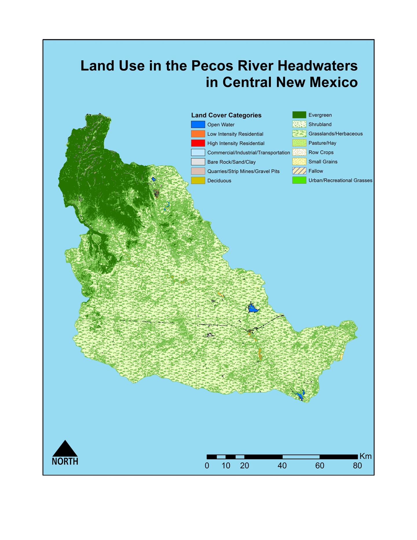
The next step in this assignment was to download land use data.
Unfortunately, these data were not included in the data provided with the
assignment, and the 1986 data would not download from the New Mexico Resource
Geographic Information System Program (RGIS) website. Although 2000 data were
available from RGIS, one had to download four separate covers: Fort Sumner East
and West, and Santa Fe East and West.
One combined these four layers by using Merge (ArcToolbox>>Data
Management>>General>>Merge). The layer was then clipped so that it
includes only the Pecos Headwaters (ArcToolbox>>Analysis
Tools>>Extract>>Clip).
For this land use map, the symbology was
particularly important. The three images, below, show several ways that the symbology can be displayed for the same map.
Between the first map and second map, certain similar categories
were combined into one category. In order to do this, one had to change the symbology to Quantities>>Graduated Colors, and
specify 8 classes. The breakpoints were manually set to have maxes that were
directly below the next category.
|
Original Categories |
Consolidated Categories |
|
Open
Water |
Open
Water |
|
Low
Intensity Residential |
Residential |
|
High
Intensity Residential |
|
|
Commercial/Industrial/Transportation |
Commercial/Industrial/Transportation |
|
Bare
Rock/Sand/Clay |
Unvegetated
Rock/Sand/Clay |
|
Quarries/Strip
Mines/Gravel Pits |
|
|
Deciduous |
Forest |
|
Evergreen |
|
|
Shrubland |
Grassland/Shrubland |
|
Grassland/Herbaceous |
|
|
Pasture/Hay |
Agriculture |
|
Row
Crops |
|
|
Small
Grains |
|
|
Fallow |
|
|
Urban/Recreational
Grasses |
Urban |
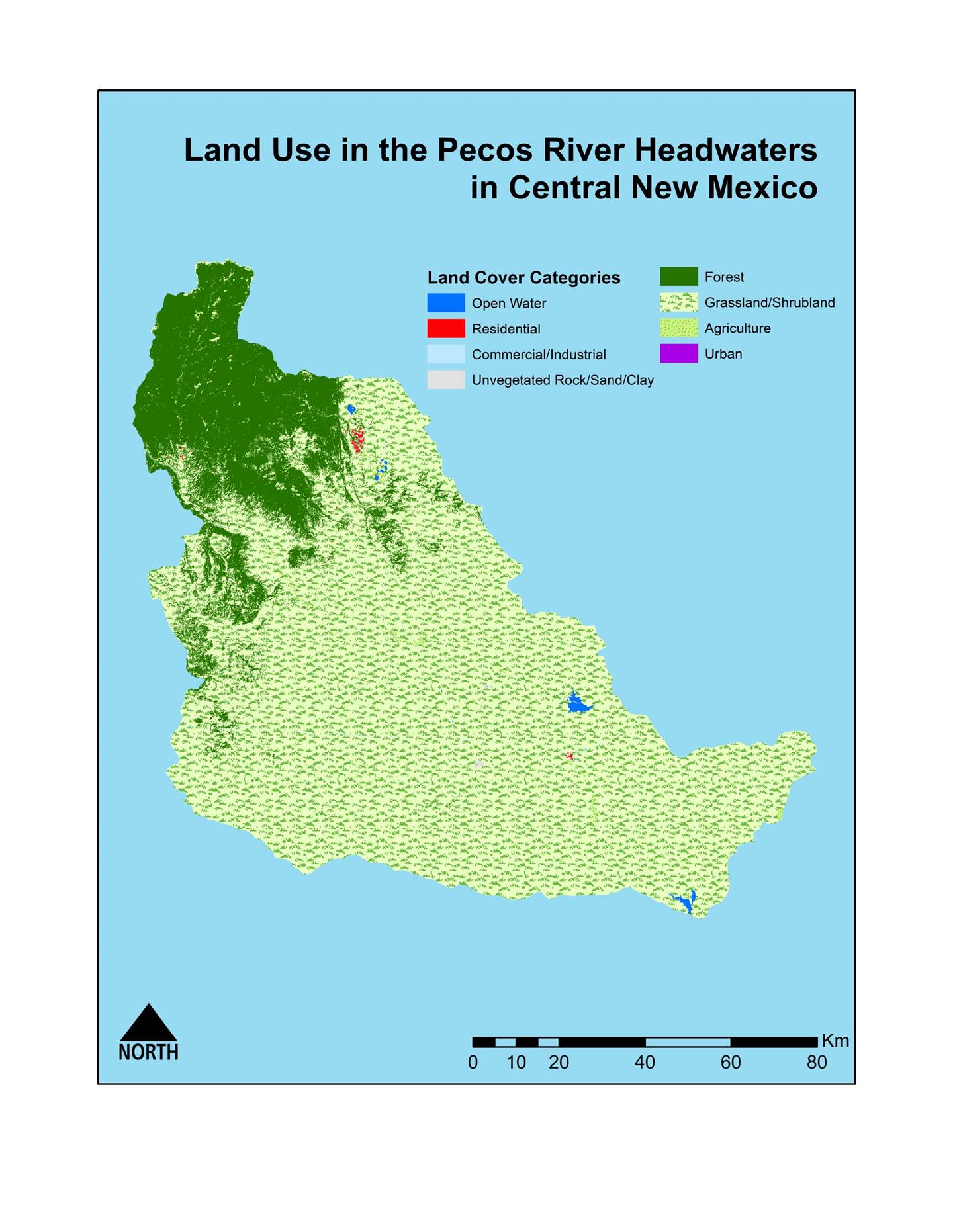
Between the second and third maps, one focused on increasing the
contrast between the categories. Therefore, one removed symbology
that included images or patters, and instead used solid colors without
outlines. For areas where a lot of shapes of different land use are close
together, the outline could potentially be thicker than the distance between
shapes, and so these areas would be dominated by the default outline color
(gray).
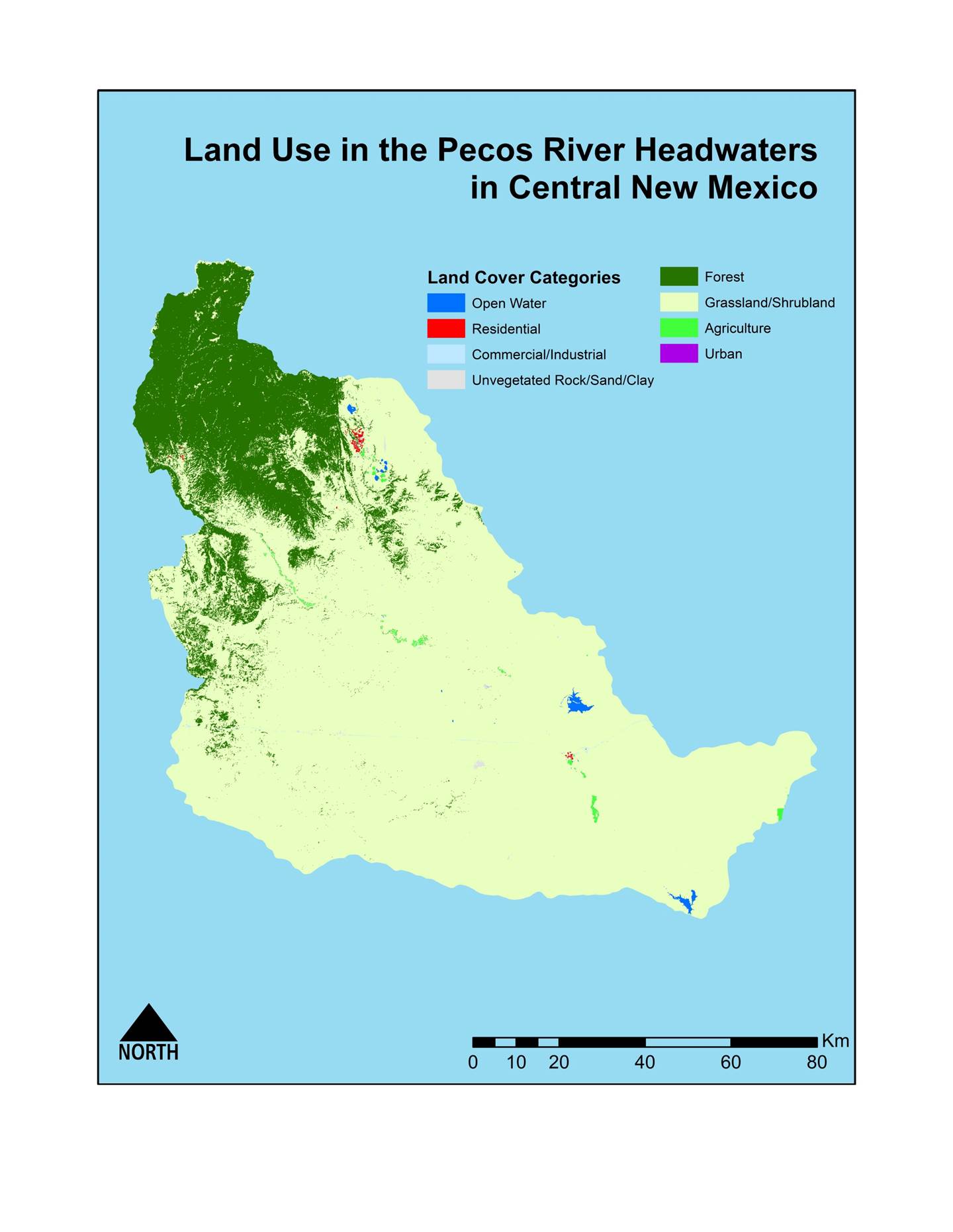
At first glance, there are several things that these maps are
missing that could make them better. First, these maps have no temporal
context. That is, the maps do not specify what year of data is being shown.
Second, other geographic features, such as elevation (land cover can change
with elevation) and streams (agriculture may be along rivers) are not shown.
Finally, the map does not specify what the three visible clusters of
Residential land use are, and the map maker could have easily added labels for
areas with the highest population density.
Optional Assignment #1 tasks the student with completing the GeoHMS portion of the HEC-HMS course taught by the U.S.
Army Corps of Engineers Hydrologic Engineering Center in Davis, CA. The
student must install HEC-GeoHMS on their computer as
well as HEC-HMS in order to run the basin model. These exercises are advanced
training beyond the scope of CE 547.
Optional Assignment #2 tasks the student with completing the GeoRAS portion of the HEC-RAS course taught by the U.S.
Army Corps of Engineers Hydrologic Engineering Center in Davis, CA. The
student must install HEC-GeoRAS on their computer as
well as HEC-RAS in order to run the basin model. These exercises are advanced
training beyond the scope of CE 547.