Ian Latella
CE 547
Assignment #2
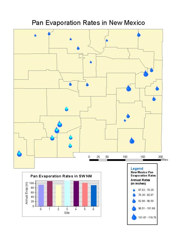
In order to better visualize the amount of pan evaporation at each site, I changed the size of the water drop symbol to correspond with the value. This way it is easier to see trends in pan evaporation throughout NM. Initially I had changed the colors of the counties in order to differentiate them, although I decided that it was not necessary for what the map is trying to show. I would have liked to have elevation data for the sites in order to plot pan evaporation against elevation. I think that it might have shown a trend. I plotted the pan evaporation rates for the southwest portion of the state and it showed that there is around 20 inches of variation between the sites in that area. The sites included in this graph are highlighted on the map in a lighter shade of blue. I had a lot of difficulty in adding a scale bar to this map. When I would insert one, it would give me an error stating that I needed to change the units in the Data Frame Properties. Eventually, through trial and error I was able to get the proper scale by changing the units to decimal degrees and the output to miles.