Assignment #1:
Kim Fike
Chapter 3
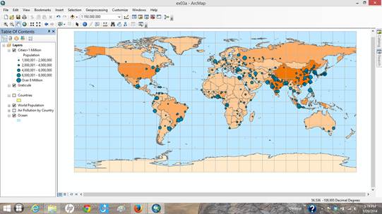
Figure 1: This image is taken from ArcGIS chapter 3 and it shows cities with populations >1million across the globe. The larger circles indicate larger populations. The map shows the majority of these cities are in India and China.
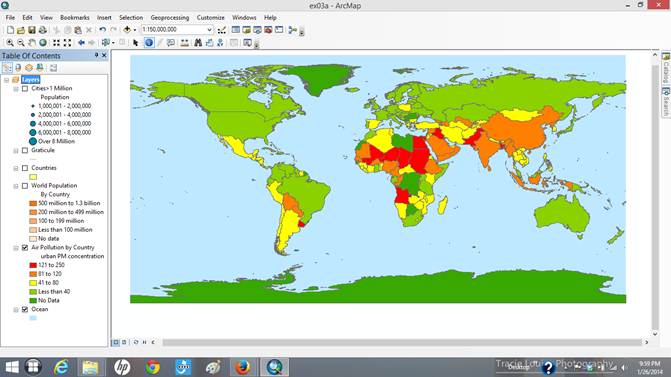
Figure2: This image shows urban particulate matter (PM) levels by country. Red colors indicate the highest levels of pollution and dark green countries show the least amount of pollution.
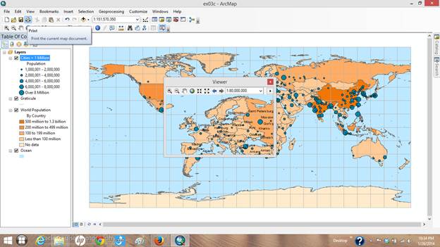
Figure 3: This screen shot shows a smaller window in the center of the image. This was done in order to learn how to use specific tools in ArcMap such as how to view a specific location in a separate window, and how that window can also be used as a ‘magnifier.’