Na Lu HOME
Homework 1
![]()
|
In this homework, I did the Excise 3.a-3.d in Getting to know ArcGIS . These exercises mainly teach
you how to display map data, navigate a map, use basic tools and look at
feature attributes. |
|
|
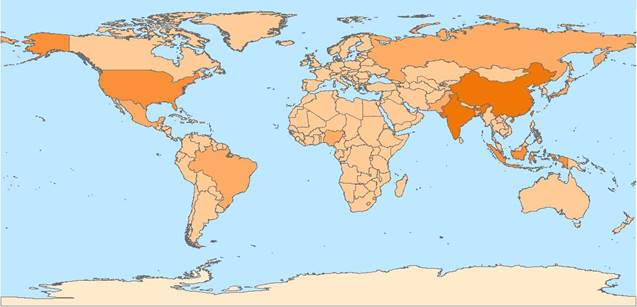
Exercise 3a
step 17 |
This map shows the World Population Layer. The
darker the color of orange, the higher the population of a country. The two
countries with darkest color are China and India. We can identify them by
using the Identify tool. When we open several layers simultaneously, it is
important to place the layers in the order that points and lines on top of
polygons so that you can see all the layers at a time. |
|
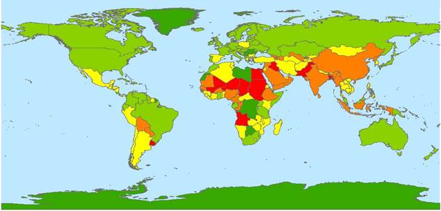
Exercise 3a
step 18 |
This map shows the Air Pollution by Country
Layer. Color red represents countries with worst air quality, followed by
orange, yellow and green. Compared to the map above, we can see some
countries with high population are also have higher air pollution level, like
China and India. However, some African countries with low population also
suffer high air pollution level. While countries like USA, though with
relatively high population, has very clean air. So it is not necessary that
high population always correlate with high population. |
|
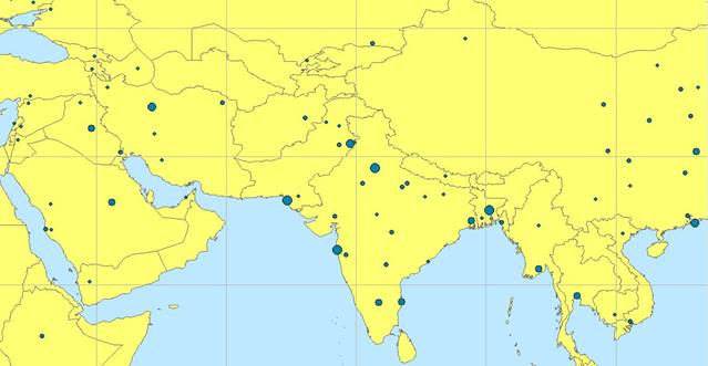
Exercise 3b
step 8 |
This exercise talks about zoom in/out, pan and
previous/ next extent. For some small countries, we have to zoom in to see it
more clearly. This map shows the Middle East area with a lot of small countries.
We can hardly tell them or use MapTip in the original
scale. But now, after zooming in and using Pan tool, we can see a map with
clearer view of this countries. |
|
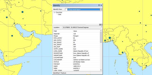
Exercise 3b
step 9 |
We are able to see the country information by
clicking Identify Tool and click the country of interest. For example, the map
on the left has the identify window for Iran. It shows the ISO numbers and so
on. |
|
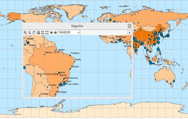
Exercise 3c
step 12
|
I learned how to turn on the feature labels only
at a specified map scale and see the viewer windows simultaneously. We can
change the settings of Display and Labels in the Layer Properties. By
clicking the Scale Range button, I can make the labels only shown when zoomed
to certain scale. By using the Create Viewer Window tool, we can create
another view window with different scale. When magnifier is selected, the
viewer window will show the same area as the main map at the bottom. |
|
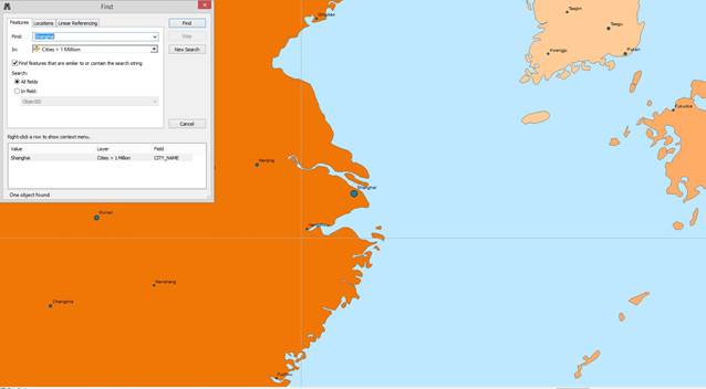
Exercise 3c
step 19 |
If we want to search a city we are not familiar with,
we can use the Find tool. The map on the left is shown after we type Shanghai
in the Find tool and select zoom to. In order to simplify the distance
measure process, this exercise teaches us how to use the bookmark. For
example, I created bookmark from the bookmark menu bar and name it Shanghai.
After that, when I dragged the map to New York, I used the measure tool to
measure the distance in two cities. I only need to click New York and click
bookmark-Shanghai and the map will show the map of Shanghai. After double
clicking the Shanghai in the map, the measure showed up. |
|
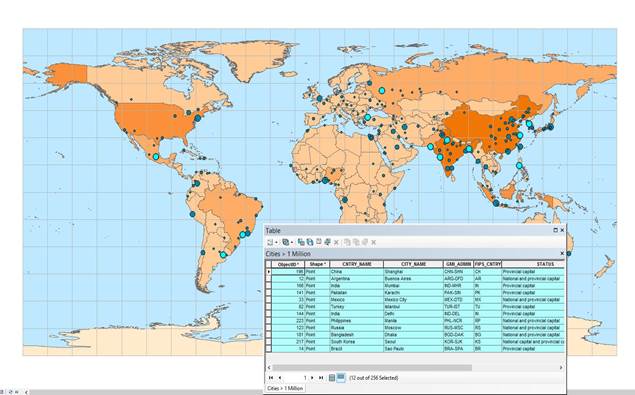
Exercise 3d
step 15 |
This exercise is all about attribute table. The
attribute table can be adjusted easily and you can also hide a column by
dragging. By clicking the tab to the left of a row, we can select a record
which also highlights in the map. For example, I would like to see cities
with population above 10 million. First, we sorted the population from high
to low. Then, we selected all the rows with population higher than 10
million. These 12 cities highlighted in the map. By clicking the Show
selected records button, the attribute only contains the records we selected. |
|
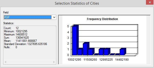
Exercise 3d
step 16 |
Simple statistics can be seen by right clicking
the filed name and statistics. The table on the left shows some basic
statistics of the 12 cities population I selected. |