
Week 4
Questions From Last Class?
Chapter 5: Images on Web Pages
Types of Graphics: JPEG, GIF, and PNG
Images (graphics) on an Web page generally take up much more bandwidth than does the text of the page. Therefore, it is important to keep the file sizes of your images as small as possible (while maintaining the desired quality and image size) so that your Web page will download and display quickly. You can keep your image file sizes smaller by using the right kind of file formats for your images.
JPEG (Joint Photographic Expert Group) format is better for photographs and for graphics with color gradients or many shadings of colors in complex arrangements. Examples:
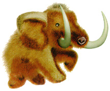
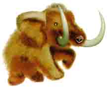
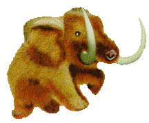
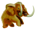
JPEG format uses a lossy compression scheme. The picture data is compressed so that the image file is smaller than the original image's file size, but some information is lost in the process. If the compression level is set too high, the image quality suffers and artifacts can be seen that result from the compression. Compare the examples below. The higher compression in the middle image saves lots of file space, but it still looks good. The even higher compression in the bottom image results in noticeable blocky artifacts within and around the mammoth.
|
JPEG with low compression (high quality) File size: 25.8K |
 |
JPEG with medium compression (medium quality) File size: 10.2K |
 |
JPEG with high compression (low quality) File size: 6.1K |
Compare the JPEG images above with versions saved as GIF format below (we will discuss GIF format next). The GIF files do not look as good as the medium compression JPEG that is comparable in size. Dithering is the technique of using points of different colors side by side in a repeating pattern to represent a third color (GIF files use a limited number of colors to in order to keep their file sizes smaller.)
 |
GIF image with no dithering. File size: 10.2K |
 |
GIF with dithering. File size: 12.4K |
When using a graphics editor program to save an image as a JPEG, you can choose the level of compression to be used. You will get a smaller file size file by using more compression, but there will be a tradeoff with image quality. You need to see how much compression you can get away with while maintaining the desired image quality.
GIF (Graphics Interchange Format) format is better for graphics with areas of solid colors and for images that use few colors. The format was developed by Compuserve in 1987, and the developers pronounce it with a soft G sound. GIFs are limited to 256 colors per image (but they can dither colors to make an image appear to have more).
GIF format uses a lossless compression scheme which allows the image to be uncompressed and displayed exactly as the original image with no compression artifacts. As you see below, it does a great job with the simple logo graphic below. The two versions saved as JPEG format have larger file sizes, and trying to use more JPEG compression to make the file size smaller results in bad artifacts.
 |
GIF file 2.3K |
 |
JPEG file 12.3K |
 |
JPEG file (more compression) 7.8K |
Remember that GIF is not as good at JPEG for photographic images because GIF's compression scheme does not do well at compression photographic images (see the previous JPEG examples).
When using a graphics editor program to save images as GIFs, you can make the file size smaller by choosing to use a smaller number of colors in the image (since the color table data that is stored as part of the file can be a sizable percentage of the total image size in some cases).
GIF images allow transparent areas. The left GIF image below has a white background color, while the GIF image on the right has a transparent background.
Note that JPEG images can NOT have transparent areas, but you could make JPEGs that have a background color that is the same as the background color of your Web page to get a similar effect (but that image would only work properly against that specific background color, while an image with transparent areas will work well against many background colors).
Note that all images on the web are rectangular. Any image that does not look rectangular is making use of a transparent background or a background color that matches the background color of the Web page,
GIF images also allow simple animation. There's no fancy HTML here... just animated GIF 89a files inserted using the <img> tag. The animated image is created as a series of images that are stored in one file. The file also specifies the time delay between displaying each of the images, and whether or not the image animation repeats (and how many times it repeats).
Note that overusing animated images might put off some people, but they might be very useful with other audiences (children, for example).
PNG (Portable Network Graphics) format is a newer graphic format that modern browsers can handle. This graphic format has some advantages of both GIF and JPEG. PNG-8 works well for images that GIF works well for. PNG-24 works well for photographs. PNG-24 has lossless compression (unlike JPEG), but the file sizes are usually larger than for equivalent JPEG files. PNG also supports multiple levels of transparency (unlike GIF), so PNG works well for drop shadows with gradients of transparency.
Below is an example of a semi-transparent drop shadow in a PNG-24 graphic. The top one is shown against the normal background color of this page, and the bottom one is shown against a patterned background image (in a table cell) so you can clearly see that the shadow is semi-transparent.
 |
|
Other Graphics Formats: Images may be stored on your computer in a variety of other formats, such as BMP (Windows Bitmap format) or as .psd files (Photoshop format). Most browsers can only display JPEG, GIF, or PNG images, so you will need to save any images for Web use as one of these three formats. Many programs exist that allow you to convert images from one file type to another (see Image Editors below).
Image Size and Resolution
JPEG, GIF, and PNG are all digital images that are made up of pixels ("picture elements"...the tiny dots of different colors that form the image). The dimensions of the images are measured in pixels. How large an image will appear depends on how many pixels per inch the display device is using. The image on the left below is 100 pixels wide; the image on the right below is 300 pixels wide. How many inches wide they appear will depend on the resolution settings of your computer's display.
I shoot digital pictures with my Nikon D90 camera that are 4288 by 2848 pixels. When printed on a color printer at 300 pixels per inch, these make wonderfully detailed 14 x 9.5 inch prints. But if placed on a Web page shown on a typical computer display (which might have something from 72 to 96 pixels per inch), this image would be over 45 inches wide! This is far too large for Web use. In general, Web pages use images with much lower resolution than are used for print media.
But can't we have the web browser display the giant image in a smaller size? Yes, but you do NOT want to waste bandwidth and time by downloading a giant picture only to display it at a small size. So, if you want to use images from a digital camera or high-resolution scanner, you will need to resize them to the actual pixel dimensions you need for your Web page.
TIP: You can find out the pixel dimensions of an image by opening it in your Web Browser. The title bar will display the pixel dimensions of the image. You can also right-click (Control-click on a Mac without a two-button mouse) on the image file, and then select Properties (in Windows) or Get Info (on a Mac) to view the dimensions of the image.
Resizing Images
You can resize images for use on your Web pages in several ways. Usually, you would do this using your favorite image editing software (see below). But you can also do this using online tools such as http://www.webresizer.com/resizer/ or a similar site.
Demonstrate webresizer.
Image Editors
The most popular image editing software is Adobe Photoshop, and its cheaper version Photoshop Elements, available for both Windows and Mac (our DMA 165 course is a good introduction to Photoshop). Other editors are available, and some are even free (such a GIMP for Windows). The Macintosh shareware program Graphic Converter is very good.
Photoshop's Save for Web and Devices command
If you use Photoshop, you should become familiar with the Save for Web and Devices command (under the File menu). This command opens a dialog box that allows you to optimize the image for Web use. The left part of the window can be set to display up to four versions of the image you are saving (the original, and three versions with different optimization settings applied). See page 154 in the textbook. The right side of the window allows you to select the file format (JPEG, GIF, PNG-8, PNG-24), and the various optimization settings that apply to the chosen format (quality settings for JPEG, number of colors and transparency for GIF, etc.). The separate panes in the left part of the window then allow you to compare the results of the different optimizations (listing the file size for each) so that you can choose which to use.
Important: Whenever you are editing an image for use on a Web page (resizing or cropping or optimizing), you should always keep an unmodified copy of the original image! Use Save As or Save for Web and Devices to save new versions of the image with new names; do NOT overwrite the original file. This is because many of the changes you make will result in an image that has lost some of the information of the original. If you later decide that you need the image in a different size or cropping or optimization, always go back to the original file as the starting point for your work (do NOT use you previous Web page image as the starting point). This is especially true for JPEG images, since multiple editings of the same image file can introduce more and more compression artifacts.
The <img> Tag
Images are inserted into web pages with the <img> tag with the basic format:
<img src="filename.gif" />
The value of the src attribute specifies the location of the image file to be displayed. Generally this is a relative URL to an image file in your site, but it could also be an absolute URL. Examples:
<img src="picfile.jpg" />
...when
picfile.jpg is in the same directory as the HTML page containing this code.
<img src="images/picfile.jpg" />
...when
picfile.jpg is in a folder named "images," which is in
the same directory as your HTML page.
<img src="../picfile.jpg" />
...when
picfile.jpg is located one directory level up from the HTML page.
<img src="http://www.someserver.com/path/to/picfile.jpg" />
...when
picfile.jpg is located on some other web server.
Note that the <img> tag is an empty element (therefore, in XHTML it ends with a space and a slash before the closing angle bracket, as seen in the examples above -- it also works fine to include the extra space and slash before the closing bracket in HTML5 as well).
IMPORTANT: Images are inline elements, so you should not place them directly into the body of an XHTML document—they should always enclosed within a block level element (such a paragraph, heading, division, table, etc.). Your pages will not validate under XHTML 1.0 Strict rules if you fail to enclose all images within block level elements (your page will validate under XHTML 1.0 Transitional or HTML5).
Images inserted one after another will butt up end to end as shown (see the HTML):

Even if you place the <img> tags on different lines of your HTML code, the images will end up on the same line (although browsers may put a little space between them by default, as shown below):
If you want the images to show up on different lines, use a <br /> tag between them, or put each image inside it's own paragraph <p>...</p> tags.
Naming Your Image Files
Do NOT use spaces in the names of your images or folders because spaces will cause problems on Unix-based servers. Also, you may want to limit your names to all lowercase letters for simplicity. You can use capital letters if you want, but then you have to remember to type the names of files into the src attribute exactly as the file names are capitalized. Avoid using special symbols other than hyphen ( - ) or underscore ( _ ) in your filenames.
Attributes for <img>
In addition to the src attribute, there are several other attributes that can be used in the <img> tag. Some of these attributes have been deprecated, and we will learn to accomplish the same things with CSS later on.
alt="text description of image"
This attribute allows you to specify text that will show up if the viewer is using a browser that either doesn't show graphics or that has graphic display turned off (a placeholder icon will show up with the text on it). This feature is important for people who have graphics turned off to speed up browsing, and to visually-impaired users who are using a speaking browser. The alt text will also show up for an image with a broken source link. Internet Explorer will show the alt text as a screen tip when the user points the cursor at the image. You can achieve this same effect in all browsers by using the title attribute. Also, the title attribute overrides the display of the alt text in IE, so you can have no screen tip appear in IE if you use title="" in the <img> tag.
You MUST include an alt attribute in order for your Web page to be passed by validators, even in HTML5. If you are using an image just for formatting, such as a bullet character image, you could use alt="" to make validators happy without specifying alt text.
width="number" height="number"
Specifies the size of the image in pixels.
Original size (72 x 72):
Width=36, Height=36:
Width=72, Height=36:
Notice that putting in a width or height different from the actual dimensions of the image will cause the browser to resize the image. You can also specify a percentage instead of a number of pixels when scaling an image (i.e., width="50%" ). This percentage is relative to the size of the parent element that contains the image (NOT relative to the original pixel size of the image).
You do not need to specify the size (the browser will simply use the image at full size) but it is a good idea to specify the size in the HTML anyway since this speeds up rendering the image in the browser. If the dimensions are not specified in the HTML code, then the browser must wait until it has downloaded the image file before it can adjust the page layout to contain it (whereas, if the dimensions are specified, the browser can leave the required space and continue rendering the page even before the image file is downloaded).
It is best to prepare your graphics at the exact size you intend to use them on your Web pages because downloading a large image only to have the browser resize it smaller wastes bandwidth. This makes the user wait unnecessarily while the larger file was downloading.
Sizing upward is also a bad idea since the graphic tends to become
blocky (here is the graphic at triple size):
Remember the previous tips (above) on how to find image dimensions.
border="number" (DEPRECATED IN HTML5)
The border attribute can be used to add a border around the image, where the value number specifies the width of the border in pixels. The default color of the border is the same as the default text color on the page. The border attribute is deprecated in favor of CSS formatting.
If you use an image as a link, some browsers will by default show a border around the image, and the color of that border will be the color of the default color of the links on that page. Using the attribute border="0" will prevent this from happening.
We will learn later how to control the border with CSS.
align="type" (top, bottom, middle, right, and left) (DEPRECATED IN HTML5)
Images within a line of text can be vertically aligned within lines of text using the alignment attribute choices "top", "middle", or "bottom". Note that the 'baseline' of a line of text is the line that most lowercase letters (those without descenders) sit on. The default alignment is "bottom", so if you want that, you do not actually have to specify it. The align attribute is deprecated in favor of CSS techniques using vertical-align, which we will learn later.
top: (top
of graphic at top of text)
middle: (middle
of graphic at baseline of text)
bottom: (bottom
of graphic is on baseline)
Floating Images Left or Right: (DEPRECATED IN HTML5)
There are two additional values for the align attribute that work in a completely different manner from the previous ones: left and right. These align values cause the image to float over to the left or right edge of the containing element (which is the the main div of this page in our current case), and any following elements will wrap around the image. See the examples below:
The
align="left" and align="right" attributes will
float the graphic to one side (left or right) and forces the text to wrap
around the graphic. Here we see a graphic which is aligned at the right
and the text flows around it. You can also specify an attribute hspace="number" and
vspace="number" to specify extra space on the right&left
and top&bottom of the image. I have justified this paragraph so it's easy
to see that the text normally butts right up against the image. Now I'll
just put in filler text so you can see it wrap. Now I'll just put in filler
text so you can see it wrap. Now I'll just put in filler text so you can
see it wrap. Now I'll just put in filler text so you can see it wrap. Now
I'll just put in filler text so you can see it wrap. Now I'll just put
in filler text so you can see it wrap.
The align="left" and align="right" attributes will float the graphic to one side (left or right) and forces the text to wrap around the graphic. Here we see a graphic which is aligned at the right and the text flows around it. You can also specify an attribute hspace="number" and vspace="number" to specify extra space on the right&left and top&bottom of the image. Now I'll just put in filler text so you can see it wrap. Now I'll just put in filler text so you can see it wrap. Now I'll just put in filler text so you can see it wrap. Now I'll just put in filler text so you can see it wrap. Now I'll just put in filler text so you can see it wrap. Now I'll just put in filler text so you can see it wrap. Now I'll just put in filler text so you can see it wrap.
Note that the images should be placed immediately before the elements that you want to wrap around the floated images.
 You
will notice that the text buts right up against the image when the image
is aligned to the left or right. Because of this, Web designers
would often built the desired offset space right into the image itself
(as a transparent area, or as an area with the same color as the background).
Alternately, they could use a transparent spacer graphic to provide the
space, as I did in this paragraph. There are two images right-aligned
here: the blue compass, and a transparent GIF to provide the space. The
cool thing about the transparent GIF (which is named spacer.gif)
is that it is a 1 x 1 pixel image (a very tiny file size) which has been
resized to a width of 10 pixels and height of 82 pixels using its width
and height attributes. This is a neat trick to provide any spacing as
required with one tiny graphic.
You
will notice that the text buts right up against the image when the image
is aligned to the left or right. Because of this, Web designers
would often built the desired offset space right into the image itself
(as a transparent area, or as an area with the same color as the background).
Alternately, they could use a transparent spacer graphic to provide the
space, as I did in this paragraph. There are two images right-aligned
here: the blue compass, and a transparent GIF to provide the space. The
cool thing about the transparent GIF (which is named spacer.gif)
is that it is a 1 x 1 pixel image (a very tiny file size) which has been
resized to a width of 10 pixels and height of 82 pixels using its width
and height attributes. This is a neat trick to provide any spacing as
required with one tiny graphic.
But nowadays, CSS margin or padding formatting (which we we learn about later) is used to provide whatever spacing is desired on any sides of an image independently. The CSS float property is used to flow text around images.
Centering Images
Note that there is no horizontal "center" align option for images. If you want to center an image horizontally on the page (or within a container, such as the main div on this page), put the image inside a paragraph and center the paragraph as done below (this aligning should be done with CSS, which we will learn later):
Adding an Icon for Your Web Site
Most browsers will display a "favicon" (favorites icon), if you have one, in the Address bar when a page is being viewed (such as the little "T145" that appears for this page). This icon may also appear in the Favorites or Bookmarks list if you bookmark the page.
The favicon is a 16 x 16 pixel image. Some browsers allow you to use GIF or PNG graphics for the favicon, but older versions of Internet Explorer required that the icon be a .ico file. To save an image as .ico format from Photoshop, you will need to install the free plugin that can be found at http://www.telegraphics.com.au/sw/
Save the .ico file in your Web space and put the following code into the head of your Web page:
<link rel="shortcut icon" href="youricofile.ico" />
If you are using a GIF image for the icon, you should use the line:
<link rel="icon" href="youricofile.gif" type="image/gif" />
If you are using a PNG image for the icon, you should use the line:
<link rel="icon" href="youricofile.png" type="image/png" />
...where "youricofile.xxx" is the name of your favicon file with the appropriate file extension. NOTE! If your favicon file is located inside an images folder (or somewhere else besides the same directory as the HTML file of your page), use the correct path to that file as the value of the href attribute.
NOTE! The favicon may not show up in the browser when you are viewing your files locally, but it should show up once you upload the page and the favicon file to the server and view the page remotely (assuming you are using the correct relative URL to the graphic file and the file permissions are set correctly).
Adding an Custom Icon for iPhone/iPad Bookmarking
If you own an iPhone, iPod touch, or iPad, you may have noticed that when you bookmark a Web page by using "Add to Home Screen," the device creates a home screen button that is a tiny picture of the page view... but for some pages, a different picture will appear in the button. For example, if you were to add this page to your iPhone home screen, the button that gets added would contain this image:

To make this happen, I created a 114 x 114 pixel PNG image (the one you see above). I then uploaded it to the folder that contains this Web page with the name "tom114.png". And then I added this line of code to the head of this Web page document:
<link rel="apple-touch-icon" href="tom114.png" />
Web Page Background Images (DEPRECATED method)
Many Web pages have a background image. We will learn how to do this later with CSS (where you have a lot more options), but you can do this now by putting the link to the background image in the body tag like this:
<body background="imagefile.jpg">
...where "imagefile.jpg" would be replaced by
the URL to the background image. If the image is to small to fill
the browser window, it will be "tiled" (repeated in the horizontal
and vertical direction to fill the window). For example, this
page uses
a background image that is only 4 x 4 pixels, tiled to fill the page.
(It's not pretty, but it's an image I had handy...and it shows how a very
tiny image can fill the background of a page). Here is the background image,
by the way: 
You must choose an background image that does not interfere with the readability of the text on the page. In the case of a photograph, this usually requires lowering the contrast and increasing the brightness of the image.
Fancy Fonts for Headlines
We will learn later that you do not have complete control over the font used to display text on your Web pages. CSS allows you to specify what font to use, BUT if users don't not have that font installed on their computers, some other font will be displayed in replace of it. This is a problem especially for unusual decorative fonts you may want to use (but which most users will not have).
To solve this problem, Web page authors often create headlines as images using Photoshop (or other image editor). Then the fancy font they want to use can appear on any machine, since it's just an image. Example (yes, I know it's misspelled):

Figure and Figcaption
HTML5 introduced the figure and figcaption elements. These tags are supported by modern browsers (but Internet Explorer only started supporting them as of IE version 9).
The figure element can be used to mark images (not just pictures, but also diagrams, illustrations, example code listings, etc.) that are related to the main content, but may be positioned independently of the flow of the main content. The figure element can have CSS formatting applied to it that will position the figure as desired. The content of the figure element should be self-contained, and it should not affect the flow of the main content if the figure is removed. The figure element could be a single image, but it can also be used for a set of images (such as a collection of thumbnail images).
The figcaption element is used to include a caption for a figure element. The figcation must be the first or last child element of the figure element. The figcaption is optional (you don't need to use one in a figure element unless desired).
<figure>
<img src="Tom114.png" alt="Picture of Tom" width="114" height="114" />
<figcaption>Fig1. Here is a picture of Tom Beach.</figcaption>
</figure>
Below you see the result of the code above. Exactly what a browser will do to display the figure may vary from browser to browser. But the browser would typically show the content of the figure element as indented, and start the figcaption text on its own line:
On the left you see exactly the same element as above, except that I have applied CSS styles to the figure and figcaption elements to show you how the figure can be moved out of the flow of the main content. This is just to give you an idea of what the figure element is used for. We will learn later how to do the CSS formatting, but for now you can wrap images or groups of images inside <figure> tags that you think you might like to reposition later with CSS. And I'm just going on and on and on here so that there is enough text to roughly equal the height of the image off to the side before we get to the next item. So you can stop reading this paragraph now. Really. There isn't anything more of interest in this paragraph. Dum dee dum, la de dah. Hmmmm. Ah... are you still here? Feel free to go on to the next paragraph. It's about something that's not an image at all, really.
Horizontal Rules
Horizontal Rules (such as the line above this section of the page) are not images, but the textbook used to include them in this chapter, so I'll mention them now. Horizontal Rules are inserted with the <hr /> tag (notice that it is an empty element). In older versions of HTML, the tag was for drawing horizontal rules, but in HTML5 this presentation-oriented meaning has been changed...in HTML5 the <hr /> is used to specify a "thematic break." But, of course, the browser still just shows it as a horizontal line.
All of the attributes for the <hr /> tag are deprecated in HTML5 in favor of CSS formatting (or just using CSS borders instead of horizontal rules).
Getting Images
You can find images online, but beware of copyright issues. You can use your scanner, but beware of copyright issues. You can use your digital camera to take your own pictures, but you will need to scale them down for Web use.
Uploading Images to You Web Site
When you upload images to your Web site (using an FTP program such as CoreFTP), remember that they must be uploaded to the same relative locations as you had them on your local site. So, if you have an images folders, you need to create the same folder structure (subdirectory structure) in your Web space. You can use the FTP program to create the folders (subdirectories).
You must also SET PERMISSIONS for image files that you upload and for any folders that you upload or create. Folders must have Read and Execute permissions set for yourself, group, and everyone. You should only set Write permissions for yourself. This is equivalent to Unix code 755. You can also set the permissions for images to 755, but since they do not require Execute settings (unlike folders) you don't need to set Execute permission (but it's OK if you do).
Important Graphics Tips
- Keep image file size as small as possible for faster page loading time.
- Create your images to be used at full size whenever possible.
- Use small "thumbnail" images to link to large-sized images.
- Add ALT text for all graphics.
- Reuse images on your pages, since the browser only needs to download it once.
Web Safe Colors
In the old days, when many monitors could only display 8-bit color depth, Web designers needed to create graphics and choose colors that would display correctly on these monitors. This is no longer a worry, since almost all computer displays use a higher color bit depth, so they are no longer as limited in displaying colors.
More information about this can be found on my Colors in HTML page.
Scalable Vector Graphics (SVG)
Although Scalable Vector Graphics (SVG) were available in previous versions of HTML, the fact that versions of Internet Explorer earlier than IE9 required a plugin to view them resulted in SVG not being as popular as they could have been. Now, HTML5 adds support for inline SVG elements with the <svg> tag. Unfortunately, not all Web servers are configured to send SVG files to browsers in the proper format...but hopefully this will change over time as SVG use becomes more common.
Scalable Vector Graphics are very different from the other formats we discussed earlier (JPEG, GIF, PNG), which are all raster graphics that are made up of arrays of pixels. Scalable Vector Graphics are "vector" graphics wherein the image is specified in terms of mathematical descriptions of the lines, curves, stroke-weights, fill colors, etc., used to make the image. SVG is a language for storing 2D images in XML format, with all the descriptions stored as plain text, and the browser interprets these descriptions to draw the image at the place and size specified. SVG images do NOT lose any quality when scaled up to larger sizes.
Look at the code of this page to see how these images were made. These first examples have the SVG code placed inline within the HTML using the <svg> tag.
The rectangle below is an SVG graphic.
The circles below are in an SVG graphic.
The rounded-corner rectangle below is an SVG graphic.
The SVG circle below has a black stroke of 6 pixels.
The two polygons below are in an SVG graphic.
A green SVG circle: that is in a line of text.
The ellipse below is an SVG graphic with gradient fill.
The ellipse below is an SVG graphic with radial gradient fill.
The square below is an SVG graphic with drop shadow filter that does not work in Safari 5.1.7 but works in Firefox 15.
The SVG graphic below contains a circle and some text.
In addition to having the SVG code inline within the HTML, you can also store the SVG in an external text file with the .svg extension. This allows you to easily reuse the SVG image on multiple pages. Also, rather than create the SVG image "by hand," you can use a vector graphics editing program to create the SVG code for you as you use the program's drawing tools. Adobe Illustrator is an example of a vector-graphics editing program that can save images in SVG format. The SVG image described in the external file can be placed on the HTML page in a number of different ways, as shown below:
The image below is an SVG graphic created in Adobe Illustrator and placed on this page with the <embed> tag. The SVG code is stored in the external text file testsvg.svg (you can open it with a text editor to see the SVG code). The image is shown at the size I originally drew it: 200px by 300px. Both Safari and Firefox display this image fine locally, but when this page is placed on the UNM server, Firefox can no longer display the image. This is possibly because of the way the UNM server handles SVG files.
The image below is the same SVG graphic as above, but placed on the page with the <object> tag.
The image below is an SVG graphic was placed on the page with the <iframe> tag.
The image below is an SVG graphic was placed on the page in a 100px x 300px iframe to show what happens.
The SVG graphic below was placed on the page with the <img> tag. The image displays just fine when I try this locally, but does not work when I try it from the UNM server. Perhaps the UNM server is not configured properly to serve SVG files this way (although I've seen it done from other servers).

The SVG image below was created in Adobe Illustrator (placed on the page here with the <object> tag). The size of the SVG file is 86 kilobytes, but it could be displayed much larger than shown here and still look fine (this page has it scaled 3 times larger).
Assignment 4 - Due Saturday, Sept. 21
Build a Web page using the elements and graphics concepts we have covered in Chapter 5. Use the HTML5 DOCTYPE. The elements and attributes that you should be using include:
- img - place several images on your page.
- src - Use the src attribute to insert images from
files in the following locations:
- located in the same directory as your HTML page
- located inside an "images" folder which is located in the same directory as your HTML page
- located on the UNM-LA Web site, via an absolute URL to that image (using the UNM-LA logo on the home page is fine).
- height & width - Specify height and width for all images on your page.
- height & width - Use these to display one image at a size smaller than its default size (please indicate in the page text or in a comment which image you do this for).
- alt - Include alt text for all images on your page.
- align right or align left - Use one or more images aligned left or right in a on page, with text flowing around the image. Note that this attribute is deprecated in HTML5.
- figure and figcaption - Place at least one of your images inside a figure element and use a figcaption to add a description.
- hr - use horizontal rules.
- center an image on your page by placing it in a centered paragraph. You will have to center the paragraph with the deprecated align attribute for now.
NOTE! All of the your images (except for the one you were told to specifically resize smaller than its default size above) should be optimized (using an image-editing program such as Photoshop, or www.webrisizer.com) for use at the size you are using them on your Web page!
Also, use an image editing program (or the www.webresizer.com site) to resize a large image (something over 500 pixels in width) down to two smaller size images with widths of 300 and 100 pixels. Place these two resized images on your web page for this assignment.
Upload the page to your Web space on ftp.unm.edu using the Web tools discussed/used in class or similar tools. You may name the page whatever you like.
Validate your page using the W3C HTML validator at: http://validator.w3.org/ .
NOTE: It is OK to get validation errors because of any deprecated attributes
you are using, but any other mistakes or errors should be corrected!
Send an email to tbeach@unm.edu that includes the URL to your Web page for this assignment.
NOTE! The Subject line of this email should be "IT145 YourName Asg. 4"
You will be graded on:
How many different web elements you used from Chapter 5.
How many different element attributes you used.
You sent the correct URL in your email.
The page validates using the W3C page validator.
Extra Credit:
- Setup a favicon for your Web page.
- Put an SVG image on your page that contains at least three shapes in it.
- Make a headline image and place it on your page.
Reading Assignment:
- Read Chapter 6 of HTML5 & CSS3 (for next week's lecture)