
Week 10
Questions from last time?
Chapter 15: Lists
I will cover chapter 15 first because I want to use lists in some of the material for chapter 14.
HTML allows you to create bullet lists (unordered lists), numbered lists (ordered lists), and definition lists. Lists are a handy way to make points in presenting things on you Web pages. And, as we will see later, they are a handy way to apply styles when making interactive links and menus.
Unordered Lists (Bulleted Lists)
"Unordered List" is what HTML calls a bulleted list. Generally, these are used to list ideas, facts, links, or other points when the order of the items is not important. For example, if you were to list the items in your refrigerator, the order of the items is unimportant. (As opposed to, say, listing the Presidents of the United States, it which case placing them in the order they served in office might be appropriate.)
Unordered lists start and end with <ul> and </ul> tags. Each item in the list is enclosed between <li> and </li> tags, where "li" stands for "list item." So, the following HTML code with make the unordered list shown after it:
<ul>
<li>Butter</li>
<li>Milk</li>
<li>Ketchup</li>
<li>Diet Coke</li>
<li>Carrots</li>
</ul>
- Butter
- Milk
- Ketchup
- Diet Coke
- Carrots
You do not have to indent the list items (as I did in the HTML code above, just for readability). The unordered list is a block-level item, and it automatically gets space above it, and the list items (which are also like block level elements, in that they start new lines—BUT the spacing between list items is suppressed) are automatically indented and given a bullet character as shown. You can use CSS to change the default margins and padding of the list and the list items, if desired, to alter this default spacing. Note that standards-complient browsers indent list items with padding, while Internet Explorer (at least the older versions) used margins to make the indent.
If you use a line break <br /> tag in a list item, it will break the list item into multiple lines and will preserve the indentation used by the list items:
- Here is an example
- This line has a line break here
and continues on this next line - Notice that the broken line does not get a bullet
- Notice that the broken line is indented
In the old days of HTML, people sometimes used <ul>...</ul> tags as a hack to indent lines, but you should do such things with CSS nowadays. I only mention it just in case you see it being done in an old Web page and wonder what they are up to. You should NOT put any text inside a <ul> element except for the text that is contained within list item tags. Violating this rule can cause validation errors for your page!
Changing the Bullet Shape
There is an deprecated attribute for the <ul> and <li> tags that could be used to specify the shape of the bullet character, such as: <ul type="circle">. This is NOT allowed in HTML5.
BUT, you can accomplish the same thing with CSS style rules. The style rule below is applied to the following list:
.circlelist { list-style-type: circle; }
- Butter
- Milk
- Ketchup
- Carrots
The values that can be used for the list-style-type property for unordered lists are disc (the default bullet shape), square, circle, or none (no bullets are displayed). You can use class styles to apply different bullet shapes to individual list items if you wanted to. I have done that in the list items below so you can see how the different bullets look (their exact size and shape will vary depending on the browser you are using):
- Disc
- Square
- Circle
- None
Using Images as Bullets
You can use the list-style-image CSS property to specify an image to be used instead of bullets. The style rule below is applied to the following list:
.pointlist2 { list-style-image: url(images/tri.gif); }
- Butter
- Milk
- Ketchup
- Carrots
Note that if the image is too large, the images may overlap in some browsers (so you may need to use CSS to adjust the spacing of the list items to prevent this).
Alternate Method: Using Background Images as Bullets
You can also use list-style-type: none to turn off the bullets completely, and then use background images applied to the list items to serve as bullets. This method gives you more control over the positioning of the bullet images, as shown below:
.pointlist2 {
list-style-type: none;
}
.pointlist2 li {
background-image: url(images/tri.gif);
background-repeat: no-repeat;
background-position: 0 .2em;
padding-left: 12px;
}
- Butter
- Milk
- Ketchup
- Carrots
The .pointlist2 class style was applied to the unordered list <ul> tag. It turns off the display of the bullets. The .pointlist2 li style rule specifies the background image, no-repeat of the image (so it appears only once in each list item), and moved it .2em vertically downward (and 0em horizontally). This style rule also applies 12px of padding to the list items to move the text inward so that it isn't overlaying the background image. You'll notice that this results in a list that is indented further than the previous example, but you could alter that by specifying a padding for the <ul> in the .pointlist2 style rule that is less than the default being used by the browser (which is typically 40 pixels).
Side note: In the .pointlist2 li style, I placed the different background properties on separate lines for clarity, but remember that I could also have used the "combined" background property to combine the three lines like this:
background: url(images/tri.gif) no-repeat 0 .2em;
I also could have put the list-style-type: none into the .pointlist2 li style rule and done without the .pointlist2 style.
Ordered Lists (Numbered Lists)
An "Ordered List" is what HTML calls a numbered list. Generally, these are used to list items when the order of the items IS important. For example, when specifying directions that must be followed in a certain order, an ordered list is good.
Ordered lists start and end with <ol> and </ol> tags. Each item in the list is enclosed between <li> and </li> tags, just as in an unordered list. So, the following HTML code with make the ordered list shown after it:
<ol>
<li>Get in car</li>
<li>Put on seat belt</li>
<li>Start the engine</li>
<li>Check for traffic</li>
<li>Drive away</li>
</ol>
- Get in car
- Put on seat belt
- Start the engine
- Check for traffic
- Drive away
Because the browser takes care of numbering the items in the list, you can easily insert or delete list items without having to worry about fixing the numbering. As with bulleted lists, you can alter the default indentation by changing the padding of the <ol> tag.
Changing the Numbering Markers
There is an attribute for the <ol> tag that can be used to specify
the style of the numbering used as markers for the list items (such as: <ol
type="a"> to
use lowercase letters instead of numerals). The values that can be used
with the ol type attribute are:
1 (Arabic
numerals)
A (uppercase letters)
a (lowercase
letters)
I (uppercase Roman numerals)
i (lowercase Roman numerals)
Note: The type attribute for the <ol> tag was deprecated in XHTML, but has been reinstated as an allowed attribute in HTML5. Some old versions of HTML allowed the type attribute to be used on individual <li> items, but HTML5 does not allow this.
NOTE: You can also change the ol list numbering using CSS style rules. The style rule below is applied to the following list:
.numlist1 { list-style-type: upper-alpha; }
- Mercury
- Gemini
- Apollo
- Space Shuttle
The values that can be used for the CSS list-style-type property
for ordered list are:
decimal (1, 2, 3, 4, 5...)
upper-alpha (A,
B, C, D, E...),
lower-alpha (a, b,
c, d, e...),
upper-roman (I, II, III, IV, V...),
lower-roman (i,
ii, iii, iv, v...),
none (no
numbers are displayed).
You can use class styles to apply different numbering style markers to individual list items if you wanted to.
HTML5 has a new attribute reversed="reversed" that will allow the list to be numbered in descending order, BUT this attribute is not supported by major browsers at this time.
Changing Where Numbering Starts
The <ol> tag has an attributes start for changing where the numbering of an ordered list starts. The <li> tag has an attribute value for changing the numbering part way through the list. These attributes were deprecated in XHTML, but are allowed under HTML5. Example:
<ol start="5">
<li>Get in car</li>
<li>Put on seat belt</li>
<li>Start the engine...</li>
<li value="10">Check for traffic</li>
<li>Drive away</li>
</ol>
- Get in car
- Put on seat belt
- Start the engine...
- Check for traffic
- Drive away
Note that when you change the numbering of a list item using the value attribute, the list items that follow it continue with that same numbering. Also note that the values of the start and value attributes are NUMBERS, even if the list is being displayed using letters. For example, here is the same list as shown above, but with a class style applied that makes it use lower-alpha markers (it still starts at the 5th letter, then jumps to the 10th letter on the fourth line):
- Get in car
- Put on seat belt
- Start the engine...
- Check for traffic
- Drive away
Nested Lists
You can nest lists within lists, multiple levels deep, including ordered lists and unordered lists nested in any combination. Here is an example
- Come home
- Eat supper
- Watch the late news
- Get ready for bed:
- Put the dog outside
- Brush teeth
- Lock the door
- Set alarm clock
- Go to sleep
- Have nice dreams
Note that you must be careful HOW you nest the lists. For instance, in the above example, the nested list is enclosed within the <li> ... </li> element of item 4. Here is the HTML:
<ol>
<li>Come home </li>
<li>Eat supper </li>
<li>Watch the late news </li>
<li>Get ready for bed:
<ol class="letters">
<li>Put the dog outside </li>
<li>Brush teeth </li>
<li>Lock the door </li>
<li>Set alarm clock </li>
</ol>
</li>
<li>Go to sleep </li>
<li>Have nice dreams </li>
</ol>
Notice how the nested list (its HTML is shown in red-bold) is enclosed within the fourth list item of the main list (shown in bold). Do NOT place the nested list between two list items. Your page will not validate properly if you do that (although many browsers may display it properly).
Also notice that in the example above, the indented list uses lower-roman numbering because of the class style .letters that I applied to it. Otherwise, it would have had standard Arabic numerals (1, 2, 3, 4).
For nested unordered (bulleted lists), browsers will automatically make the first level list have disc bullets, the second level list have circle bullets, any the third level list (and higher level lists) will have square bullets. (But you could apply CSS styles to the nested lists to format them however you want, of course.)
- Come home
- Eat supper
- Watch the late news
- Get ready for bed:
- Put the dog outside
- Brush teeth:
- Squirt toothpaste on brush
- Brush thoroughly
- Rinse
- Lock the door
- Set alarm clock
- Go to sleep
- Have nice dreams
Applying Styles to Nested Lists
When using nested lists, you can use descendent selectors to apply styles to any of the nested lists (or to the list items of any of the lists). In the nested list example below, the top level list has the class style .top applied to it. The selector ul.top li would affect the list items at the first level in the list (and, in fact, all the other levels, too, since they are also descendents). The selector ul.top ul li would affect only the second (and third) level list items. The selector ul.top ul ul li would affect only the third level (or any more nested levels, if they existed) list items. So the styles below will make the format the list as shown:
ul.top li { color: blue; }
ul.top ul li { color: red; }
ul.top ul ul li { color: orange; }
- Come home
- Eat supper
- Watch the late news
- Get ready for bed:
- Put the dog outside
- Brush teeth:
- Squirt toothpaste on brush
- Brush thoroughly
- Rinse
- Lock the door
- Set alarm clock
- Go to sleep
- Have nice dreams
Note that it would not work to try to limit the style for blue text to just the first level list items by using the selector ul.top > li (a child selector), because the nested levels inherit their settings from the level that encloses them, even if they are not targeted directly.
Controlling Bullet and Number Position
The list-style-position CSS property allows you to specify if the list item markers (be they bullets or numbers) will display outside or inside of the list item text. Here are examples of both, first with outside, and then with inside:
- Get in car
- Put on seat belt. I am going to add a lot of text to this line so that you can see how it wraps and where the number markers end up. I think I'll add even more text to get it to wrap twice.
- Start the engine
- Check for traffic
- Drive away
- Get in car
- Put on seat belt. I am going to add a lot of text to this line so that you can see how it wraps and where the number markers end up. I think I'll add even more text to get it to wrap twice.
- Start the engine
- Check for traffic
- Drive away
The default is outside. This property is inherited by any nested lists.
The Combined list-style Property
You can set the list-style-image, list-style-position, and list-style-type properties all at once with the combined list-style property. Here is an example style rule:
.mylist { list-style: url(images/tri.gif) inside square; }
Note that in the example above, an image will be used for the bullet—but if the image is can't be accessed, the square bullet choice will be used.
Any of the three properties that you do not give a value for will get its default setting. The default for list-style-image is none. The default for list-style-position is outside. The default for list-style-type is disc for unordered lists and decimal for ordered lists.
Description Lists
You can also create Description Lists (which were called "Definition Lists" in older versions of HTML) to define terms using the <dl>, <dt>, and <dd> elements. The <dl> ... </dl> tags enclose the entire list. Within that are pairs of terms and definitions. The term goes inside the <dt> ... </dt> element, and is followed by the definition that goes inside the <dd> ... </dd> element. Example showing the HTML code and the description list below it:
<dl>
<dt>Banana</dt>
<dd>A long yellow fruit that is one of Tom's favorite
foods.</dd>
<dt>Apple</dt>
<dd>A spherical red fruit that keeps doctors away. Not
to be confused
with the computer company, which should not be eaten.</dd>
<dt>Orange</dt>
<dd>Orange you glad this is a short list?</dd>
</dl>
- Banana
- A long yellow fruit that is one of Tom's favorite foods.
- Apple
- A spherical red fruit that keeps doctors away. Not to be confused with the computer company, which should not be eaten.
- Orange
- Orange you glad this is a short list?
By default, the definition is indented as shown. You could apply styles to format the list if desired (for example, the style rule dt {font-weight: bold;} would make the terms in the description list bold.
Chapter 14: Enhancements and Dynamic Effects with CSS
Using CSS in modern Web browsers, it is possible to achieve some interesting dynamic effects, such as making images appear/disappear, making popup menus, and making rollover buttons. Such effects required Javascript programming before the days of CSS.
Displaying and Hiding Elements
The CSS display property determines how an element will be displayed on a Web page. This property can have the values block, inline, list-item, or none. The values can be used to change the default way that certain elements are displayed—for example, list items can be made to appear like inline elements (all on the same line, end to end), and links can be made to appear like block elements (each link like a separate paragraph). The none value applied to an element makes it completely vanish from the page, and the other elements flow into the space that the element would have taken up.
For example, there are three division below which each have distinct colors and borders you you can see them easily. By default, they have the setting display:block.
This is Division One
This is Division Two
This is Division Three
Below this paragraph are three divisions identical to the ones above, except that the second division has the style declaration display:none set. So even though the code for the second division is in the HTML of the page, it does not appear, and the other page content acts as if it did not exist.
This is Division One
This is Division Two
This is Division Three
Compare the example above with the example below. There are again three divisions that are identical to the first set we saw, and they all have their default of setting of display:block (since they are divisions). BUT, the second division now has the added declaration of visibility:hidden in its style rule (the default for all elements is visibility:visible). So the second division is invisible...BUT it still takes up the space it would if it had the declaration visibility:visible. So, there is an important difference between hiding an element with visibility:hidden and using display:none.
This is Division One
This is Division Two
This is Division Three
But how can we use this to create interesting effects? There are some examples below.
In the division below (the white div below with id="funpix") there are four links (each in a paragraph with margin: 0 0 1px 0;). I don't want the links to actually go anywhere, so I am using a null address of href="javascript:;" (one could also make a null link with href="#" but if the user clicks on that link, the page would scroll to the top of the page in some browsers). Each link contains two images between the <a> and the </a> tags, like this:
<p>
<a href="javascript:;" title="Totoro">
<img class="tiny" src="images/totoro150px.jpg" alt="Totoro"
width="33" height="44" />
<img class="big" src="images/totoro150px.jpg" alt="Totoro"
width="150" height="196" />
</a>
</p>
There are three important styles:
#funpix img { border: none; }
#funpix a img.big { display: none; }
#funpix a:hover img.big {display:inline; position:absolute; top:10px; left:52px; }
The first style makes sure the images (which are inside the link tags) don't show any link borders.
The second style hides the big version of the images (which have class="big") by setting display:none for them.
The third style, which comes into play when the cursor is hovering over the link, will make the big image appear (display:inline), and position it absolutely relative to the division so that it appears to the right of the tiny versions of the images.
Point at the tiny images to see the effect:
Here are some other image rollover examples:

Here is a rollover image example floated to the left at the beginning of this paragraph. The image is really a 1 by 1 pixel transparent gif resized to 96 x 123 pixels. The class style .rollover1 applies a background image to the image, and floats the image to the left. The style .rollover1:hover changes the background image when the mouse cursor is over the image. This method may not work in older browsers that only recognize the :hover pseudo-class for links, and not images.
Text Here is another rollover image example floated to the left of this paragraph. This is a link that contains just the word "Text", which we will format to not display. The link uses href="javascript:;" to make it a null link that goes nowhere (and it won't even jump to the top of the page as a href="#" null link would). The class style .rollover2 applies a background image to the link, displays it as a block of the right size for the image, and floats it to the left. The .rollover2 span style hides the display of the link text (makes the word "Text" not display). The style .rollover2:hover changes the background image when the mouse cursor is over the image. The style also sets the cursor to the default arrow so that this doesn't appear to be a link at all (since I'm just going for the "change an image upon rollover effect here," and I'm using the link just because older browsers recognize a:hover and possibly not other kinds of :hover).
The rollover example floated over to the left here is exactly the same as example rollover2 above, except that there is no text at all between the <a>...</a> tags of the link. The class style .rollover3 applies a background image to the link, displays it as a block of the right size for the image, and floats it to the left. The style .rollover3:hover changes the background image when the mouse cursor is over the image. The style also sets the cursor to the default arrow so that this doesn't appear to be a link at all (since I'm just going for the "change an image upon rollover effect here") but the cursor could be allowed to change normally if this was to be used as a link. This example is slightly simpler because we don't have the <span> and the style to make the span text invisible -- but if you are going to use this technique for actual links, you may want to have the text in the link (as in example rollover2 above) so that the text could be displayed in a text-only browser by using an alternate style sheet.
Here is a page with some more fun pop-up stuff.
Using CSS to Format Lists of Links
Here is an unordered (bulleted) list of links. All the link examples below use this same plain old list of links:
Below is bulleted list #2, which has been turned into a "rollover button" menu via CSS formatting. The overall class style applied to the <ul> tag (.nav2) sets the font-family and font-size, and sets the list-style-type to none so that any list items in the list will not show a bullet. The padding of the <ul> was set to 0 (zero) to move the list over to the left edge of the page. Nothing was changed about the formatting of the <li> tag.
The rest of the formatting is done to the <a> tag via the descendent selector .nav2 a (the <a> tag is what makes links, of course). The links are displayed using the block property, and given a width of 7 ems and a height of 1.2 ems, plus some padding to move the edges of the block away from the text a little. Note that I am using ems here (instead of pixels) so that if the person viewing the page changes the fonts display size in their browser (which changes the size of the em), the size and spacing of the blocks will change by the same proportion. The style also gives a background color to the block. Note that because I used the block display property for the links, you can click anywhere in the block to activate the link (not just on the text itself).
The rollover effect comes from the .nav2 a:hover style, which changes the background color and the text color for the block when you place the mouse cursor over the link (try it in your browser!).
You can use CSS styles to change many different properties (text font, size, color, style; background colors or images; borders; and so forth to achieve lots of rollover effects. You can have separate styles to format the a:link, a:visited, and a:hover states separately.
Remember that when formatting rollover links, you must have the styles listed in the order a, a:link, a:visited, a:focus, a:hover, a:active. You don't have to use all of them, but any you do must be in this order, otherwise the effects you want may not appear (for example, if a:link follows a:hover, the a:link style will override the display of the a:hover style).
Here is another rollover menu in the division styled with #nav3. It is very similar to the previous example, but I especially like the trick of changing the border widths on rollover to make it appear as if the button is being pushed in when you rollover it. You can study the styles used by this menu.
Below is bulleted list #4, which has been turned into horizontal "rollover button" menu via CSS formatting. There is a div with the id style #nav4 applied that acts as a container for this particular list. The #nav4 style also specifies the font-family, font-size, and font-weight that will apply to all contained parts (unless these settings are overridden by other styles). The #nav4 ul style removes the margins, padding, and default bullet appearance of the list. It also includes a nowrap value for the white-space property to ensure that the horizontal menu will not wrap around in a narrow window. This lists gets arranged horizontally by setting the display property to inline in the #nav4 li style. Thus, the list items (which normally each start on a new line), will line up in a row. The #nav4 a style takes care of most of the formatting of the "buttons" (background color, text color, text decoration, and padding to determine the size of the buttons beyond the text. The #nav4 a:hover style specifies the changes to the text color and background color to produce the rollover effect. Take a look at the list in the browser.
Notice that the Home link looks different than the other links in this list. This is to demonstrate how you can make the current page's link appear different than the other links to give someone browsing the site gets a visual indication of the current page. Note that this does not actually disable the link, it just makes it look different. To get this effect, I created the style #nav4 li#current a that formats the link for a "current" page appearance. Then, for the link belonging to the current page, I gave it's list-item the id="current".
Below is bulleted list #5, showing a second way that can be used to make a horizontal menu by using left float to position the "buttons." This version is also in a separate div (with an id style named #nav5), which sets the font and sets the overall height and width of the div. The #nav5 ul style sets the overall margins and padding of the list to zero, and sets the list to display no bullets. The style sets text-align:center so that the text in all buttons will be centered. The #nav5 li style sets the buttons to float left, and gives them a consistent width, height, and margin settings. The margin setting provides the gap between the buttons. The #nav5 a style formats the appearance of the buttons, while the #nav5 a:hover style controls the look of the rollover effect. (Finally, the #nav5 li#currentpage a style allows for a button to be set with a different appearance when it's the link to the current page.)
The buttons here all have the same width (in list #4 the widths of the buttons depended on the length of the text in the buttons).
Below is bulleted list #6. This version is similar to list #2, but it uses a background image behind the link text. The background image is the same for all of the buttons (it is applied by the .nav6 li style) so it saves download time (compared to using separate button graphics in a Javascript menu). The rollover effect changes the text color and changes the background image to a different one.
You can find lots of fun list formatting at: http://css.maxdesign.com.au/listamatic/
Let's go look at some of these now!
Making Drop-Down Menus with CSS
You can use CSS to make drop-down menus. Unfortunately, the CSS necessary for this is not supported in Internet Explorer version older than IE8.
Textbook 6th Edition example of menus (no formatting)
Textbook 6th Edition example of menus (with formatting)
Page with menus with submenus.
Fahrner's Image Replacement
I am not impressed with Fahrner's Image Replacement (FIR) technique, but if you ever want to try to figure out how a lot of the cool stuff you can see in the csszengarden, you will have to understand it.
Basically, it puts the text of a header (such as an h1, h2, etc.) inside a span, and then uses a style to make the span invisible (with display:none;). Another style sets the background image of the header, so that this image can be seen instead of the header. I have done this below with an <h6> (since I'm not using any of those on this page—but I also gave the h6 a class name to demonstrate that you could replace multiple headers of the same type with different images if you identify the headers with class names):
Text that vanishes
The HTML and styles for the above item are given below:
<h6 class="fir"><span>Text
that vanishes</span></h6>
h6.fir span { display: none; }
h6.fir { background: url(images/totoro.jpg) no-repeat; height: 123px }
Enhancements Using CSS3
CSS3 is not yet a finished standard, but browsers have already implemented many of the features that will eventually be in the CSS3 standard. BUT, this means that different browsers may have implemented these features with different code. So, to use one of these new features and have it work in many different browsers, you often need to specify several variations of the properties in a CSS style rule (so that each browser can find a version it understands).
Vendor Prefixes
As the different browser vendors have developed the new CSS3 features, they have used their own variation of the CSS style property names by preceding the property names with each vendor's unique prefix. For example, the prefix for Microsoft Internet Explorer is -ms- (including the hyphens shown), and Firefox uses the prefix -moz- (since it's based on Mozilla), Safari and Chrome both use -webkit- (since they are based on the Webkit engine), and Opera uses -o-.
So when you want to use a certain CSS3 feature, you'd need to include all the different variations for browsers you want to support. Also, for very old browsers, you'll want to include a property that will take effect if none of the newer properties are understood. You can start the style rule with this old property, and then list the separate vendor CSS3 properties after it...that way the newer browsers will ignore the old property setting in favor of the newer one listed later. AND, you can end by including a property (with no vendor prefix) that will hopefully eventually become the CSS3 standard...which will be used by any browser that eventually does implement that standard (so your Web site will continue to work in the newer browsers). But this does mean putting a lot of extra lines in your CSS styles. For example, to make a background color that is a linear gradient, your style might be:
.gradientbkg1 {
background-color: #00ffff; /* This background color
gets used if the gradients below are not recognized by the browser */
background: -webkit-gradient(linear, left top,
left bottom, color-stop(0%, #9999ff), color-stop(100%, #ffffff)); /*
for older versions of Safari */
background: -webkit-linear-gradient(top, #9999ff,
#ffffff); /* for newer versions of Safari
*/
background: -moz-linear-gradient(top, #9999ff,
#ffffff); /* Firefox */
background: linear-gradient(top, #9999ff,
#ffffff); /* CSS3 standard? */
}
This sounds like a lot of hassle, but you can find online code generators that help you out. These are Web pages where you can enter the parameters of the style you want (such as the type of gradient and the starting and ending colors), and the page will give you the necessary lines of code you need paste into your CSS style. An example of a CSS3 generator Web site is: http://www.css3generator.com/
So let's look at some of the new formatting properties available in CSS3.
Gradient Backgrounds
Before CSS3, if you wanted a gradient background color, you used a background image that has one color fading to another color (and usually made the graphic file quite small by making the image 1 pixel wide and tiling it. But CSS3 adds more options for background color gradients as can be seen in the examples below. Look at the CSS of this page (the internal style sheet) to see how these are done.
This div has id style grbkg1 applied, which has a linear gradient starting with color #9999ff on the top and color #ffffff at the bottom.
This div has id style grbkg2 applied, which has a multicolor linear gradient starting with color #9999ff on the top (0%), going to color #ffffff in the middle (50%), and ending with color #99ff99 at the bottom (100%).
This div has id style grbkg3 applied, which has a multicolor linear gradient starting with color #9999ff on the top (0%), going to color #ffffff in the middle (50%). Since no additional color stop is specified, the #ffffff color continues to fill the rest of the div.
This div has id style grbkg4 applied, which has a linear gradient starting with color #9999ff on the LEFT and color #ffffff at the RIGHT.
This div has id style grbkg5 applied, which has a linear gradient starting with color #9999ff on the TOP-LEFT and color #ffffff at the BOTTOM-RIGHT.
This div has id style grbkg6 applied, which has a radial gradient starting with color #9999ff on the outside and color #ffffff in the center.
Multiple Background Images
HTML5 allows you to specify multiple background images on elements, and the browser will layer up those elements.
Here is an image (space-tile.jpg) that I got from a free image Web site http://1-background.com/ that shows a star field that will seamlessly tile in repeated:

And here is a image (LM.png) of the Apollo 11 Lunar Module, courtesy of NASA, that I edited to have a transparent background:
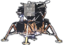
And here is a div that has
a default black background
color, and both the LM.png
and the space-tile.jpg images
as background images.
The space-tile image tiles to
fill the div. The lunar module
image is set for no-repeat and is
positioned 300px over and 100 px
down from the upper-left corner
of the div.
The background-attachment cot
the LM.jpg is set to scroll and the
background-attachment of
space-tile.jpg is set to fixed...
see what happens when you scroll.
The CSS style used for the div above is:
#multipbg {
background-color: black;
background-image: url(images/LM.png), url(images/space-tile.jpg);
background-repeat: no-repeat, repeat;
background-position: 300px 100px, top left;
background-attachment: scroll, fixed;
height: 400px;
padding: 10px;
color: #bbf;
font: bold 16px/20px Arial;
}
The background-color is specified as black so that the div will be filled with black in an old browser that can't understand the multiple background images (and this is the color that would show behind your multiple images if they don't cover the background of if they have transparent areas). You could also specify a background-image property here with just one background listed, and that background would be used by any browser that can't understand multiple images.
The next four lines specify the background-image, background-repeat, background-position, and background-attachment values for the multiple images, with the values for each image separated by commas. I used two images, but you can use more than two.
Note that the first image values listed in the multiple image lines belong to the image that will be in front of the other layered images. The last image is the one in back.
You can put multiple background images on almost any HMTL element (not just a page background).
Rounded Corners
Because all HTML elements are rectangular in shape, Web page layouts can look kind of "blocky". To alleviate some of this blockiness, Web designers in the past would insert images that had rounded corners and transparent areas to "pad out" rectangular elements with apparently curved edges. To make things easier, CSS3 allows you to round the corners of elements.
Here is a div with the corners rounded that have a radius of 20 pixels. It was created with the style:
#roundy {
-moz-border-radius:
20 px;
-webkit-border-radius: 20px;
border-radius: 20px;
background-color: white;
padding: 10px 20px; margin-right: 20px;
}
You can also round the top-left, top-right, bottom-left, and bottom-right corners separately.
UNM-LA
Apple
Microsoft
Here is an "index card file" layout with "tabs" and a "card" of information below. This particular layout doesn't do anything, but when we cover JavaScript in a while, we will learn how to make different card contents appeared here as different tabs are selected.
The point right now, however, is to show how the tabs (which are little divs) can have just their top corners rounded. And the bottom corners of this "card" are rounded.
The CSS style for the rounded-corner tabs above looks like this:
.tab {
width: 100px; height: 25px;
background-color: #FFE;
margin: 0 4px 0 0; padding: 8px 10px 0 10px;
float: left;
border: solid 1px black;
-moz-border-radius-topleft: 15px;
-webkit-border-top-left-radius: 15px;
border-top-left-radius: 15px;
-moz-border-radius-topright: 15px;
-webkit-border-top-right-radius: 15px;
border-top-right-radius: 15px;
}
You can also make boxes will elliptical corner rounding (different radii in the x and y directions), and you can make a circular element by rounding the corners using a radius that is equal to half the width and height of the element.
Here is a box with elliptical corners, which uses the style:
#ellip {
height: 200px; width: 400px;
padding: 20px 30px;
background-color: white;
-moz-border-radius: 40px/20px;
-webkit-border-radius: 40px/20px;
border-radius: 40px/20px;
}
Here is
a circular div.

It's up to you to make sure that your content isn't going outside the area of a rounded-corner element, since the content still thinks it's in a rectangular element. Here I made no attempt to constrain my text, so it's running over the edges of the shaded are of this circular div.
The border-radius property is not inherited.
In a browser that does not understand the rounded corner CSS, all of the above divisions will simply show up as square-cornered rectangles.
Text Drop Shadows
This feature works the same in all browsers that support it (you do not need to add vendor prefixes). You can add drop shadows to text using the text-shadow property and specifying the x-offset, y-offset, blur radius, and color.
This paragraph uses text drop shadow.
.drop1 {
text-shadow: 2px 2px 3px #6666FF;
font: 30px Arial;
}
Multiple Drop Shadows
.drop2 {
text-shadow: 1px 1px 0px #FFFFFF, 3px
3px 4px #666633;
font: 40px Arial;
}
You can specify multiple drop shadows by adding another set of drop shadow values after a comma.
You can't specify individual text-shadow properties (for example, there is no separate text-shadow-color property).
The text-shadow property is inherited. You can use text-shadow: none to turn off an inherited text shadow.
Box Drop Shadows
You can also add drop shadows to other HTML elements. This feature is not as widely supported as text drop shadows, so it requires vendor prefixes in some browsers. You can add drop shadows to elements using the box-shadow property and specifying the x-offset, y-offset, blur radius, and color. You can also include the optional inset keyword (to put the shadow inside the box), and the optional spread value (to specify a length that the shadows spreads out from the box). As with text drop shadows, you can specify multiple box shadows by including multiple sets of parameters separated by commas.
Here is a div with a drop shadow.
.drop3 {
-moz-box-shadow: 10px 10px 6px rgba(25,25,25,0.3);
-webkit-box-shadow: 10px 10px 6px rgba(25,25,25,0.3);
box-shadow: 10px 10px 6px rgba(25,25,25,0.3);
width: 200px;
background-color: white;
padding: 20px;
}
Here is a div with an inset shadow.
.drop4 {
-moz-box-shadow: inset 4px 4px 15px #666;
-webkit-box-shadow: inset 4px 4px 15px #666;
box-shadow: inset 4px 4px 15px #666;
width: 200px;
background-color: white;
padding: 20px;
}
Assignment 9 - Due Saturday, Nov. 9
1) Study one of the interesting rollover lists at http://css.maxdesign.com.au/listamatic/ and incorporate it into one of your own web pages.
2) Write a report that explains to me IN DETAIL what all of the styles used by the rollover list DO to make the rollover effects work. (You will email this report to me.)
3) Make an absolutely-positioned image appear on your page when you rollover either a text or image link.
4) Use a gradient background on some element of your page.
5) Use rounded corners on some element in your page.
6) Use a text drop shadow or a box drop shadow.
Upload the page to your Web space on ftp.unm.edu. You may name the page whatever you like.
Your page must validate as HTML5 using the validator at: http://validator.w3.org/
Your CSS must validate using the validator at: http://jigsaw.w3.org/css-validator/
Send an email to tbeach@unm.edu that includes the URL to your main page for this assignment.
NOTE! The Subject line of this email should be "IT145 YourName Asg. 9"
You will be graded on:
How well you followed directions
You sent the correct URL in your email.
The page validates using the validators listed above
Extra Credit:
- Use multiple background images (small number of points).
- Add drop-down menus with formatting to your page (large number of points).
Reading Assignment:
- Read Chapters 16 of HTML5 & CSS3 (for next week's class)