
Week 8
Questions from last time?
Remember to have your Midterm ready at the start of class next week! It's 30% of your course grade.
Chapter 11: Layout with CSS
The CSS Box Model
CSS treats all elements on your Web page as if they were contained in a box which has settings for its content area, paddings, borders, and margins as shown in this model:
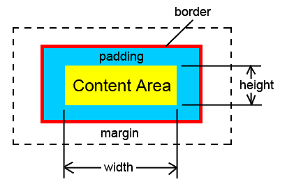
The content area might contain a paragraph, a span of text, an image, a division, or any other HTML element. The width and height of the content may depend on the rendering of the content (for example, the font, size, style, and line height of text are part of determining its rendered size of elements containing text), or it may be an intrinsic property of the content (such as the width and height of an image). You can also specify the width and height of sectioning elements such as divs, sections, articles, etc.
Outside the content area is the padding, which specifies the offset from the edge of the content to the border. The width of the padding can be controlled separately for the top, right, bottom, and left sides. Outside of the padding is the border (which can also have separate specifications for top, right, bottom, and left sides). The border may or may not be present, but it still represents the dividing line between the padding and margin even when it's not displayed. Outside the border is the margin area (which can also have separate specifications for top, right, bottom, and left sides).
The background color or background image of an element fills the content, padding, and border areas (it will show through a border that has gaps in it, such as a dashed border). The margin is transparent.
In HTML there are block-level elements (such as paragraphs and divisions that are formatted as boxes and which start on a new line), and there are inline elements (such as spans of text and images, which don't start a new line). Recall that HTML5 does not use the term "block-level" or "inline", but the concept is still valid, and I will use those terms. Some of the box model formatting does not apply to some inline elements (for example, changing the top and bottom margins of a span of text has no effect).
Cascading Style Sheet (CSS) formatting rules allow you to position the boxes on the page in many different ways, which is why we now use CSS to do the layout of Web pages (unlike the old days when Web authors often used HTML tables to control the layout of their Web pages). The promise of CSS layout was a longtime coming, because some browsers (especially old versions of Internet Explorer) did not fully or properly implement CSS positioning—but modern browsers do an excellent job of positioning.
Page Structure
CSS positioning requires that you have a well-structured Web page. The reason that we have emphasized divisions (created with the <div> tag), sections (created with the <section> tag), articles (created with the <article> tag), and other sectioning elements (even though they visually haven't done anything for us up to now) is that by arranging your page with the content divided into these sectioning elements allows you to apply styles to each element and format different sections of the page as desired.
The page you are reading, for example, has a wrap division (a div with ID="wrap") that controls the width of the page and centers it in the window, a header division to hold the class title (don't confuse this with the head of the HTML document), a navi division that holds the links for the web site, and a main division that holds most of the content.
HTML5 Structure in Older Browsers
The new structural elements introduced in HTML5 (section, article, etc.) can cause problems in older browsers that were written before HTML5, since the old browsers don't know what those tags mean. Happily, it's not hard to get around this.
When most browsers run into HTML tags they does not know, they just treat the tag as a inline element (like a <span>) but otherwise ignore it. But, we want the old browsers to treat the new structural elements as block-level elements so that they get space before and after them automatically, as they do in modern browsers. We can do this by adding the following style to your page's CSS style sheet (or to the external style sheet used by all of your pages):
article, aside, figcaption, figure, footer, header, hgroup, menu, nav, section { display: block; }
This makes the browsers treat those new elements as block-level elements.
The other problem is older versions of Internet Explorer (prior to IE9) -- these older versions of IE will ignore CSS formatting you apply to unknown elements. But you can get around this by putting the line below into the <head>...</head> element of your Web page (either above or below your CSS style sheet or the link to your external CSS style sheet):
<!--[if lt IE 9]>
<script src="http://html5shiv.googlecode.com/svn/trunk/html5.js"></script>
<![endif]-->
See page 287 in the textbook if you are curious about how this works. Otherwise, just put it into the head of your Web page.
Floating Elements

Remember how we were able to align images to the left or right, and the rest of the page content would flow around the image (sort of like what you see at the right here). Well, the align attribute of the <img> tag is now deprecated, but you can accomplish the same thing using the CSS float property. The image on the right, in fact, has class="picright" as an attribute, and i created a style that I named .picright that has the following style rule:
.picright { float:right; }
You can float elements (not just images) to either the left or right using either of those two values of the float property. The float property is NOT inherited.
I am a paragraph that is floated to the right. I have style floatpara assigned to me. What fun!
As mentioned above, you can float other elements besides images to the left or right. At the right of this paragraph I have floated another paragraph of text. That paragraph is actually immediately before THIS paragraph (the one you are reading here) in the HTML for this Web page. The class style of floatpara (just a name I made up) is applied to that paragraph. I also made its background color lime so that you could easily distinguish it from this paragraph. When you float a paragraph like that, you must specify how wide the floated paragraph should be (more on setting widths in a bit). Also, I set the margins of the floated paragraph to zero (more on setting margins in a bit). If you don't set the top margin to zero, the floated paragraph would not line up with the paragraph to its left (because it would get extra space at its top in many browsers). Here is the class style I used to float the paragraph:
.floatpara { float:right; width:150px; margin:0; background-color:lime; }
Clearing Floated Elements
You can run into a problem where you need to clear content past elements that have been floated to the right or left. (In the old days, this was accomplished using the "clear" attribute of the <br> element...but that attribute is now deprecated.) We use the CSS clear property, which can have the values left, right, or both. Example:

This is a short paragraph with a left-floated image before it. This text is too short to clear beyond the image. So...
The next left-floated image buts up against the first image as it tries to float to the left side of its containing element.
To fix this, I made a style named clearstuff that has the property clear:both so that any element I apply the class .clearstuff to will wait until it's beyond any floating elements on both sides before appearing on the page. In the fixed example below, I inserted a line break at the end of the paragraphs and applied .clearstuff to it (the tag is <br class="clearstuff" /> ). Often you would just apply the .clearstuff style to the next element (such as a div that you wanted to start clear of any floats), but in the case below, if I apply .clearstuff to the Totoro image, the following paragraph of text still does not clear the previous floated elements. So in this case it was easier to put in a line break and apply the style.
This is a short paragraph with a left-floated image before it. This text
is too short to clear beyond the image. So I put a line break at the end
of this paragraph with .clearstuff applied.
So now the second floated image can float all the way to the left side
of its container without bumping into the other floated image. I also have
another line break <br class="clearstuff" /> at the end
of this paragraph that
clears before the next content.
Width and Height
This text is in a div with id style #side1 applied. It has width: 150px and height: 220px. In case you are wondering about the cool scroll bar, it is there because of the way I have handled the overflow in the style that formats this div (see further down the page).
Since this is a div, it can hold many paragraphs (this is a second one), headings, and images -- and all the other stuff you can put on a Web page."
Hi!
You specify the width and height of an element using the width and height properties. The values for these properties can be expressed in lengths with units (such as 200px or 15em), or they can be expressed as percentages (such as 70%). If you use percentages, these are relative to the size of the parent element that contains the sized object (the parent's size is 100%). If you don't specify a width or height, the value auto is assumed. For the little green paragraph in the previous section, I did not specify a height because I was not sure how much room the paragraph would need (since this depends on the font settings).
The element at the right here is a div that has both height and width specified. That paragraph is located in the HTML code just below the "Width and Height" heading. The style for that div is this ID style:
#side1 {
width: 150px;
height: 220px;
float: right;
overflow: auto;
background-color: lime;
}
Note that the height and width of an element do NOT include the padding, border, and margins. Therefore, an element on the page is going to take up more space than just the height and width would indicate. If you don't specify a width for an element (and it doesn't have an intrinsic width, like an image does), the width will be calculated by subtracting the left and right margins and paddings from the width of the parent element.
You can use the min-height of min-width properties to specify the minimum height or width an element can have. You can use the max-height of max-width properties to specify the maximum height or width an element can have. So, for example, you could set the width of an element to be 50% (of the parent element), but also set a min-width and/or max-width to keep the element from getting to narrow or too wide as the browser window is resized.
The height and width properties are NOT inherited.
Overflow
What happens if you specify a width and height for an element (such as a paragraph or div or section) that is not large enough to display all of the contents of the element? This is what happened in the div#side1 example above. So what happens to the overflow material?
You control what happens to the excess content with the overflow property. The overflow property can have the values: visible, hidden, scroll, or auto. The value visible is the default, and it will allow the height of the element to expand in order to display all of the content. The value hidden will keep the element at the width and height specified, and will chop off the display of the content (only showing what fits). This may seem to be a bad thing, since the user will not be able to see the content, but the example on page 320 of the textbook shows how this can be useful (the string of tiny images fills a paragraph across a page, and if the page is made wider by resizing the window, more images that were initially hidden will appear to continue filling across the page).
The value scroll for the overflow property will show vertical and horizontal scroll bars in the element so that the user can scroll to see the hidden content. Note that this choice uses space for both scroll bars even if one or both is not needed. The value auto will show scroll bars only if needed to see any hidden content.


In the example I have at the right, there is a div that contains a paragraph with a line of 14 images. The white-space property of that paragraph is set to no-wrap, so the images don't break onto multiple lines. The div has its overflow property set to auto, so the scroll bar appears at the bottom allowing the user to scroll to see all of the images. I made the images inside the div have no border so that no blue border would show up on the images when they are links (I didn't actually put links on all of them).
The styles used to make the scrolling picture box above are shown below:
#pix {
width:370px;
height:160px;
overflow:auto;
float: right;
margin: 0 0 10px 20px;
} /* pix is the id of the div that holds the picture paragraph */
#pix p {
margin:0;
white-space:nowrap;
}
#pix img {
margin-right:10px;
border: none;
}
The overflow property is NOT inherited.
Margins
The margins provide transparent space between elements. The margins on the top, right, bottom, and left can be set individually. Margins can be specified in lengths with units (such as 10px or 0.5em) or as percentages of the size of the parent element (such as 10%). If a zero margin is desired, no unit need be given. A margin can also be set to auto if you want it to take up the rest of the available space once width and the opposite margin are specified. (If you look at the picture-scroller div above, you can see that I put left and bottom margins of 20px on it to keep the text from butting right up against it.)
The margin property can be used to set multiple margins at once. Examples:
body { margin: 0; }
The example above sets all margins of the body to zero. If only one value is given, it applies to all four margins.
#footer { margin: 5px 15px; }
The example above would set the top and bottom margins to 5px, and the left and right margins to 15px. When two values are given they apply to top/bottom and right/left.
#navi { margin: 0 1.2em 10px; }
The example above would set the top margin to zero, the right and left margins to 1.2em, and the bottom margins to 10px. When three values are given they apply to top, right/left, and bottom.
#sidebar { margin: 5px 10px 20px 600px; }
The example above would set the top margin to 5px, the right margin to 10px, the bottom margin to 20px, and the left margin to 600px. When four values are given they apply to top, right, bottom, and left, in that order. You can remember this order because it goes clockwise from the top. Or, you can note that t r b l is the word "trouble" without any vowels, if that helps anyone who has trouble remembering the order.
You can also set individual margins as in these examples:
*:first-child { margin-top: 0; }
#navbar { margin-right: 2em; }
.floatrightpic { margin-left: 10px; margin-bottom: 10px; }
When one element is below another (such as a paragraph following an h1 heading line), only the larger of the two abutting margins (either the bottom of the h1 or the top of the paragraph) will be used. This is called "margin collapse." This does NOT happen with left and right margins.
If you specify the width, left margin, and right margin of an element, and it turns out not to fit exactly into the size of the parent element, then the right margin will default to auto and will expand or contract to make the element fit, if possible (if not possible, you will get overflow). Example:
This div has a width of 300px, and both left and right margins set to 50px (and there is no padding or border). You can see that the right margin has come out larger than 50px.
You can center an element horizontally within another element by setting a width, and setting both the left and right margins to auto. The two side margins will share the available space equally. Very useful:
This div has a width of 300px, and both left and right margins set to auto. That centers this div horizontally within its parent the main div of this page.
Because block-level elements have default margins on top, you will often need to set a top margin to zero to avoid some spacing issues (especially since some browsers will put in the default space in some situations where other browsers will not; the only way to be sure getting the same result in all browsers is to actually specify a margin, either zero or some other value so they all use the same value).
The margin property is NOT inherited.
Padding
You add padding to an element with the padding property (or you can set padding for an individual side by using padding-top, or padding-right, or padding-bottom, or padding-left). The width of the padding is specified as a length with units (such as 10px or 2em) or percentage (such as 2%, where this percentage is relative to the size of the parent element).
When using the padding property, you can specify 1, 2, 3, or 4 values, and it works in the same way as it did with margins: one given value would apply to all padding sides; two values given apply to top/bottom and right/left; three values given apply to top, right/left, and bottom; four values given apply to top, right, bottom, left (trouble).
Any background color fills the content area AND the padding area (and the border, if there are any transparent areas of the border). Margins are transparent.
Example: The div below has left and right padding so that the text does not but right up against the edge of the area background color.
This div has no margins or border. The top and bottom padding are set to a value of zero. The left and right padding are set to 20px. This paragraph is justified so that you can better see where the content area ends. The padding was specified in the style rule with the declaration padding: 0 20px 0 20px
Do you see the gap between this div and the edge of the main div of this page on the right? That space is there because the main div has some padding.
The padding property is NOT inherited.
Borders
You can add borders to an element using the border property. This is a combined property that sets the border-width, border-style, and border-color properties in one step, like this:
.brdrExample { border: 2px solid blue; }
This paragraph has the style shown above applied to it. If you don't want the border to but right up against the text like this, simply add padding to the element (as in the next three examples below).
The border width can be specified in length values with units (such as 1px or .2em), or you can use the preset values thin, medium, or thick:
This has a thin border
This has a medium border
This has a thick border
If you use the separate properties (border-width, border-style, and border-color) to set borders in an element, don't forget to include border-style because it has a default of none, so no border would show up without it.
It is often useful to set the properties of of just some of the four borders of a element separately. his can be done with the border-top, border-right, border-bottom, or border-left properties. Here is an example:
.brdrEx2 {
border-top: 6px double
red;
border-bottom: 6px double red;
}
This paragraph uses the style .brdrEx2 shown above.
The border-style property can have values of solid, dotted, dashed, double, ridge, groove, inset, outset, or none as shown in the examples below (all of which have 9px red borders. I also added some padding):
This has a solid border
This has a dotted border
This has a dashed border
This has a double border
This has a ridge border
This has a groove border
This has a inset border
This has a outset border
Some of these styles only work well with fairly thick borders, and the shaded ones (the last four) may not work well in some browsers if the color is too dark.
You can also use properties that target just one property of a specific border by using things like border-bottom-style: solid; or border-left-color: blue; but I generally find that either setting all borders at once, or setting individual borders handles the cases I need.
Borders are NOT inherited.
Vertical Alignment of Elements in Text
Remember the align attribute of the <img> tag could also be used to specify the vertical alignment of the image when it was in a line of text? Well, that is also deprecated now, so instead you use the CSS vertical-align property.
The image  in
this line has vertical-align: baseline set
with a style.
in
this line has vertical-align: baseline set
with a style.
The image in
this line has vertical-align: top set
with a style.
The image in
this line has vertical-align: text-top set
with a style.
The image in
this line has vertical-align: middle set
with a style.
The image in
this line has vertical-align: text-bottom set
with a style.
The image in
this line has vertical-align: bottom set
with a style.
The image in
this line has vertical-align: super set
with a style.
The image in
this line has vertical-align: sub set
with a style.
The image in
this line has vertical-align: -50% set
with a style.
There are subtle differences between some of these alignments, and they may result in slightly different positionings in different browsers. The percentage value can be either positive (upward) or negative (downward).
Avoiding Deprecated Properties in HTML
Images: Now we know enough CSS formatting to avoid using any deprecated attributes for the <img> tag. Instead of align="right" or align="left", you would use float:right or float:left in a style applied to the image. The vertical-align options in the previous section replace the function of all the other values of the <img> tag's align attribute. Instead of using the deprecated hspace or vspace attributes of the <img> tag, use CSS margins to move the text away from an image (and you can even control the margins on all sides separately, which hspace and vspace did not allow you to do). Instead of the deprecated border attribute of <img>, use CSS border styles. In particular, you can use the CSS style img { border: none; } to prevent the default link borders from showing up around images that are used as links.
Horizontal Rules: All of the attributes of the <hr /> tag are deprecated (but the tag itself is still valid). The <hr /> is pretty plain with no attributes (see the horizontal rule right above this paragraph), but you can use CSS properties to format horizontal rules, and even do things with color that HTML could not (although how the rule looks may depend on your browser). Also, it is not as straightforward to get the horizontal rule aligned left or right. Here's an example:
.demo { height:6px; color:red; background-color:yellow; width:25%; margin-right:75%; margin-bottom:1.5em; }
The horizontal rule above has class="demo"— the style rule for that class is shown above.
Some people prefer to do away entirely with using the <hr /> tag and make their horizontal lines with borders. The paragraph below this one is blank (except for a non-breaking space) and I have set its top border with the style rule below:
.topbdr { border-top: 3px double gray; }
Cursor Shape
Also covered in this chapter of the textbook is the CSS property to control the shape of the mouse pointer (cursor). There are several choices of cursor shape, but most of these are only useful in conjunction with javascript programs. Two useful ones to know are the default shape (the slanted arrow) and the pointer shape (the hand with its index finger out that usually appears over links). If you want a link to NOT show the cursor as the pointer hand (for example, you may want to do this for the link to the current page so that users are less likely to click the link) you can do this:
a.playdead { cursor: default; text-decoration: none; color: black; }
The last word in this sentence is a link
...but it doesn't look like a link, and the cursor does not change over it.
So you could repeat the same menu on many pages, and simply make the link that belongs to the current page look and act differently with a special class style applied to it. For example:
Home | Week 5 | Week 6 | Week 7 | Week 8 | Week 9
Positioning
Now we get to the fun part: positioning elements on your Web pages with CSS. Some layouts use the float property (which we discussed above) to arrange content on a page, and we will see examples of that. But first we have to discuss the other positioning that CSS can do with its position, top, bottom, right, and left properties.
Normally, elements appear on your Web page in the order you have them in the HTML code of the page. This default behavior is called static positioning. Elements can also be positioned as relative, absolute, or fixed (these are all values of the position property).
Relative Positioning
If you apply position:relative to an element, you can specify how to move it relative to the place it would appear in the static (default) flow of the page. The rest of the elements in the static flow of the page do not shift position, and the place where the positioned element came from would have a gap left behind as if the element were still there. This can be used to do things like this:
Bananas!
A fun yellow fruit!
The banana is your friend. This would be a paragraph about the wonders of bananas, except this is just an example.
In the example above, the word "Bananas!" is an h1 heading. The line "A fun yellow fruit" is a paragraph that was originally below the h1, but has been repositioned to follow the h1 using this style:
.moved {
margin: 0;
position: relative;
top: -1.5em;
left: 11em;
}
The style changes the location of the paragraph by moving its top upward by 1.5em (the negative causes it to move UP), and moves its left edge in by 11em (these are both relative to where it would have been in the default static flow of the page). I could also have specified the shift based on the original position of the bottom edge of the paragraph, or the the right edge of the paragraph. You use either top or bottom, and either left or right — just one from each pair). I used ems here instead of pixels so that the spacing would adjust properly if the font size is changed. You can also specify the shift in % (percent of the parent element's size).
Unfortunately, you see the blank space that the paragraph left behind (even though I tried to minimize it by making all the margins involved zero. Because this gap gets left behind, position:relative is a pretty lame tool for positioning elements. BUT, it has a very important side effect when used in conjunction with absolute positioning (see below).
Absolute Positioning
If you apply position:absolute to an element, that element is removed from the static flow of the page (there is no gap left behind—the later items just move up to fill the gap), and you can specify the absolute position of the top (or bottom) and left (or right) edge of the element. These positions are either:
a) relative to the body of the page, or
b) relative to the most recent ancestor that has any positioning other than static assigned to it.*
*Note: This is the important use of position:relative — You can set a parent to use position:relative (but don't actually move it with a top, left, bottom, or right property), and then any descendents of that parent that uses absolute positioning will have its positions measured from the edges of the parent element.
Here is an example of absolute positioning. This section (which has a white background so that you can see it) contains an image of Totoro and then these paragraphs of text. The image has the style .leftpic applied, which is defined by the CSS style rule below:
.leftpic {
position: absolute;
top: 0;
left: -130px;
}
This style absolutely positions the Totoro image (relative to its parent div, remember, because that div has position:relative set for it in a style) so that the top of the image is at the same vertical position as the top of the div, and so that the left edge of the Totoro image is 130px to the left of the left edge of the div (the negative value moves the element to the left, a positive value moves it to the right; a negative value for top would have moved it up, and a positive value would have moved it down).
As you can see, absolute positioning is cool. The moved element did not leave a gap, and it let me move the image into an otherwise unused part of my page.
Another example can be seen with the two images in the space next to the styles below. Those images are really in the HTML flow right above this paragraph, but they have been repositioned with these styles:
.TotoroAbs { position: absolute;
top: 33em;
left: 24em;
z-index: 4;
}
.chimpAbs { position: absolute;
top: 28em;
left: 20em;
z-index: 3;
}
This example also shows that absolutely-positioned elements can overlap (more about that later). This ability to overlap can be used for many interesting effects we will discuss some of these in a later class). I have positioned these images with em units so that if the text size is changed, they should still be in about the same positions with respect to the text.
This block of text is another division (which is really inside the division on the right with the white background). It has been positioned over here with this style:
#leftbox {
width: 190px;
position: absolute;
top: 37em;
left: -220px;
background-color: yellow;
padding: 10px;
}
There is another example on the left here. The yellow box is really a division that is inside this white div (in the HTML static flow), and it has been positioned absolutely over to the left of this div. Note that when you are positioning paragraphs or divisions, you will need to specify a width for the element.
The position property is NOT inherited.
Z-index (Who is in Front?)
If positioned elements overlap (which can happen with relative, absolute, and fixed positioning) you can specify which element is in front (the one that covers up the other) with the z-index property.
In the example above (in the white div) the Chimp came after the Totoro in the flow of the HTML, so the Chimp would normally be in front, BUT notice that I assigned z-index values to them. Because Totoro has the larger value, he is in front.
The z-index values are positive or negative integers. The element with a larger z-index appears in front of one with a smaller z-index. You do not have to assign the z-index values in order (you can leaves gaps in the number sequence). You can use negative z-index values, but these will appear behind the body content (and could be covered by the body's background color).
Note that an element that is actually located within the HTML code of a parent section may be positioned anywhere on the screen, but that element is nested inside the parent section.
If you have nested elements that are absolutely positioned and have z-index values, those items will be placed in order relative to each other, but the group as a whole will be placed in order of the larger structure according to the z-index of the parent that they are nested in.
The z-index property is NOT inherited.
Fixed Positioning
If you apply position:fixed to an element, you can specify where that element will be located relative to the browser window, and the element will not move as the Web page is scrolled. This allows you to fix elements in place in the browser window. Versions of Internet Explorer before IE7 do not support fixed positioning.
If you do not specify a top or left (or bottom or right) value for the fixed position item, it will appear where it would first appear in the flow of the page (although some browsers may disagree on exactly where that is), and then stay fixed to the window there as the page is scrolled.
I'm fixed in place!
Top
An example of a fixed element can be seen in the upper-right corner of your browser window. There is a small div fixed in place with the style below (the code for the div actually appears in the HTML flow of this page just above this paragraph):
#fixbox {
width: 70px;
height: 70px;
position: fixed;
top: 0;
right: 0;
background-color: white;
padding: 4px;
}
The fixed div has a link that can take you to the top of this page no matter where you happen to be scrolled to at the moment.
The position property is NOT inherited.
Leveling the Playing Field
Before you start making a Web page layout, you should be aware that different browsers have slightly different default settings for such things as exactly how much spacing there is before and after block elements, exactly what sizes to use for headings, etc. Also, the browsers may differ as to where spacing needs to be added (some browsers will add spacing before a paragraph at the start of a table cell, and other browsers won't, for example).
Rather than trying to remember where all these differences are, and having to deal with them all the time, there are a couple common techniques for 'leveling the playing field' before you start so that you have a better chance of getting the same results in all browsers.
Method #1: CSS Reset
With this method, you begin your CSS style sheet with styles that will 'zero out' the default spacing and sizing by making all margins, paddings, etc., equal to zero, and setting all font sizes to default 100%, etc. You can get the CSS style rules from Eric Meyer's Web site at the link below:
http://meyerweb.com/eric/tools/css/reset/
Note that this is just a starting point -- you then have to go on to define all of the various spacings and sizes that you want by adding more style rules to get the design you want. Because of this, it may be easier to use Method #2 below.
Method #2: Normalize the Default Styles
With this second method, you use a CSS stylesheet that has been written to make all of the default spacing, sizes, etc., the same for all browsers by explicity setting these values with CSS style rules (and not leaving these settings up to the whims of the browser's defaults). All you need to do is get the normalize.css file, and then link it to your page.
You can get the normalize.css file that was created by Nicolas Gallagher and Jonathan Neal at the link below:
http://necolas.github.com/normalize.css/
For Either Method #1 or Method #2...
For either method, you add a link to the external reset or normalize CSS files by adding a link line in the head of your Web page, like this (for the Method #2 example):
<link rel="stylesheet" type="text/css" href="normalize.css" />
Adjust the path to the normalize.css (or reset.css) file as needed depending on where you store that file in your site.
You could add additional CSS styles of your own to those external files, BUT for this class I ask that you store any of your own styles in a separate external CSS file (just add a second link to your own CSS file following the link to the rest or normalize CSS file) so that I don't have to hunt around in that default normalize.css file to find YOUR styles. Or store your own styles in an internal style sheet that comes after the link to the reset or normalize file.
Note that both of the methods above incorporate the CSS rules for making the new HTML5 elements (such as section, article, header, etc.) show up as block-level elemnets, so you don't need to add those rules to your own style sheet if you link to one of these reset or normalize style sheets.
Example Page Layouts
Here are some links to pages with example layouts. You can look at the source code of each page to see the HTML and CSS that makes the page.
Note that if your Web site has a common layout used by many of its pages, you can keep the CSS styles for the layout in an external style sheet that all of the pages are linked to, and then you can alter the layout of all those pages at once by modifying the styles in the external sheet.
Here is a Fixed-Width Centered layout that will center the content of your page in a fixed-width division. With a fixed-width layout you can keep the parts of your Web page from spreading far apart if the page is viewed on a very wide monitor. Also, lines of text are hard to read if the lines are very wide (your eye can get lost when it snaps back to the left to pick up the start of the next line).
This Elastic Centered Layout is the same design as the example above, but all of the dimensions in this version are specified in em units, so if the default font size is changed, the page width will change to keep the design looking the same (otherwise the line-wraps would occur in different places).
This next sequence of pages shows you how floating sections can be used to lay out a Web page:
Float1 shows the sections of the page in their static locations (with background color so you can see the sections).
Float1b shows a simple two-column layout with header. Read the information in the page to see how it is done. The sidebar is fixed width, while the main section resizes as the window size is changed.
Float1c shows how to add another side column for a three-column layout with header. Read the information in the page to see how it is done.
Float1d shows how to add a footer section for a three-column layout with header and footer. Read the information in the page to see how it is done.
Float1e shows how the basic float layout can be used inside a fixed-width centered division. Read the information in the page to see how it is done.
Float1f shows how a background image can be used in a Float1e layout to help fill a larger monitor. Read the information in the page to see how it is done.
This Zia Spacemodelers page also shows how background images can help fill a wide monitor when you are using a fixed-width page. (The links on that example page do not work.)
This Page with Fixed and Variable Width divisions shows how part of you layout can be absolutely positioned, but you can have one section that expands as the window is widened.
This Percentage Layout shows a three column layout that have widths expressed in percentages so that the whole page adjusts when the browser window changes width. Note that this page uses min-width and max-width properties to keep the content area from getting squeezed too small or too large. There is also a Slightly Different version of the same page.
Here is a Fixed-Width Layout with Absolute elements. It includes some examples of absolute positioning.
Here is the Fixed Positioning Version of the previous page. Be sure to scroll the two pages to see the difference in behavior.
There are several sites on line that have more examples of how page layout can be done with CSS. Perhaps they have a layout that you can learn from to make your own page. Here's an example:
http://www.maxdesign.com.au/articles/css-layouts/
There is no new assignment this week.
Work
on your Midterm Project for next class!
We will be using the material from today in Assignment 8 after our Midterm Project. But you may want to work on this assignment now while the material is still fresh in your mind (assuming you have your midterm assignment done).
Reading Assignment:
- none